Top 20 Apartment Design Ideas for Every Style
I’ve always been fascinated by how a few thoughtful design choices can completely flip a dull apartment into a space that tells a story. Over time, I’ve walked into tiny, chaotic homes and walked out inspired. Below are 20 apartment design ideas I personally observed or helped execute. Each one offered something fresh—whether it was a play on color, smart usage of space, or how natural light turned a tight room into a breathable haven.
Let’s dive into the first four that kick-started my obsession with clever interiors.
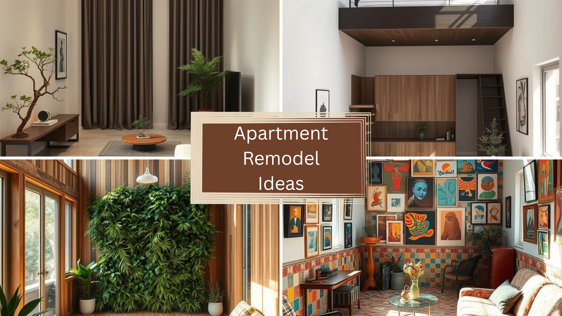
Boho Chic Apartment Redesign
I still remember walking into this boho-styled apartment—it was like entering a dream. The sunlight poured over woven textures, dried pampas, and soft neutral tones. What stood out was the layering: rattan chairs with tasseled throws, colorful macramé on walls, and a mix of plants in every corner. The owner told me, “This space heals me,” and honestly, I felt it too.
It wasn’t just about aesthetics. The living room had a floor mattress setup that doubled as seating during the day and a bed at night. Instead of crowding with furniture, they used multi-purpose stools and foldable accents. It felt lived-in, not staged. The handpicked pottery and handmade textiles added authenticity—a nod to culture and comfort.
What made it work? Freedom. There were no rules here. Patterns clashed, and it still felt harmonious. Every element had a soul. And that’s the essence of boho—it’s messy, personal, and full of heart.
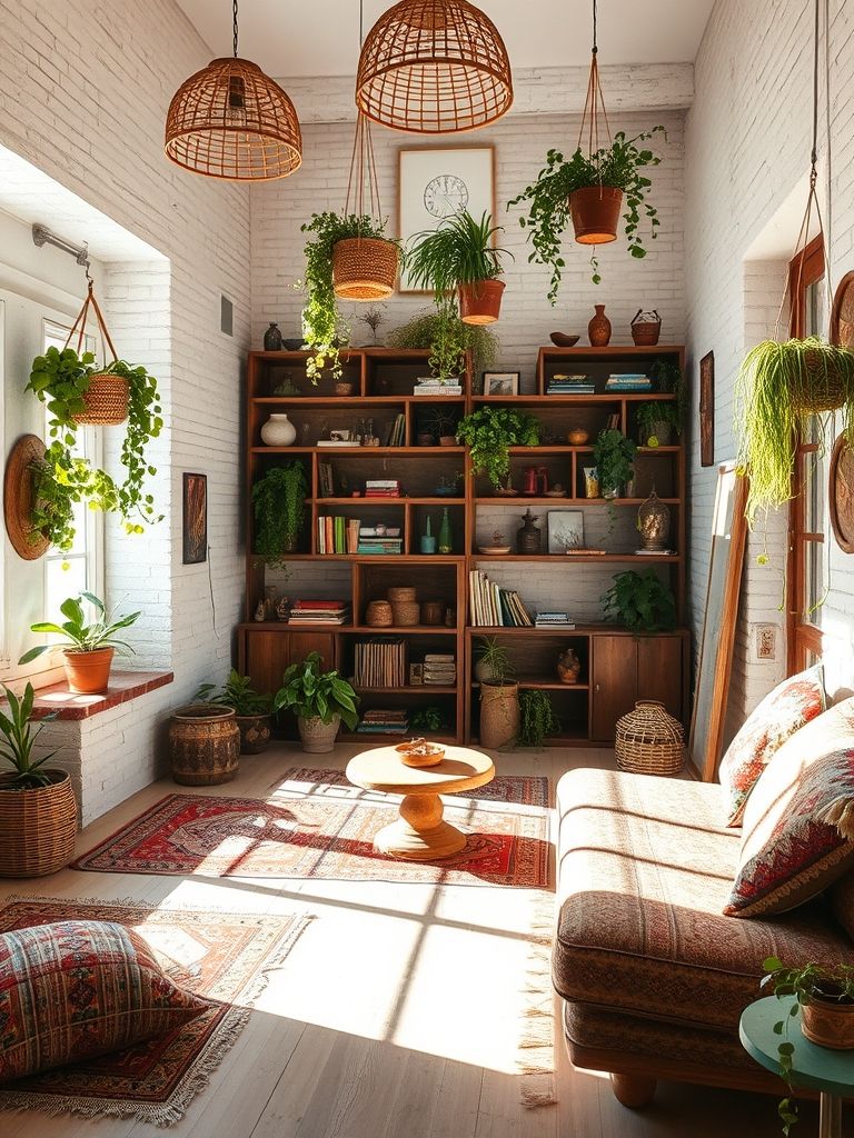
Color-Blocked Modern
This one flipped my idea of minimalism. I was expecting sterile white and a black frame here and there. Instead, the designer used bold blocks—mustard kitchen walls, cobalt blue bedroom accents, and a coral reading corner. Sounds loud? It wasn’t. The furniture was clean-lined, and every color zone had its own vibe.
I noticed that color wasn’t just decoration—it guided how people moved through the space. The yellow in the kitchen made it energetic, almost like the room nudged you to start the day. The muted green in the workspace felt calming. Lighting was key too. It toned down boldness during the day and made everything glow at night.
And yes, this style worked in a small space. By avoiding pattern overload and sticking to matte finishes, it still looked cohesive. Color-blocking, when done intentionally, gives rooms their own identity—even in a 600 sq ft flat.
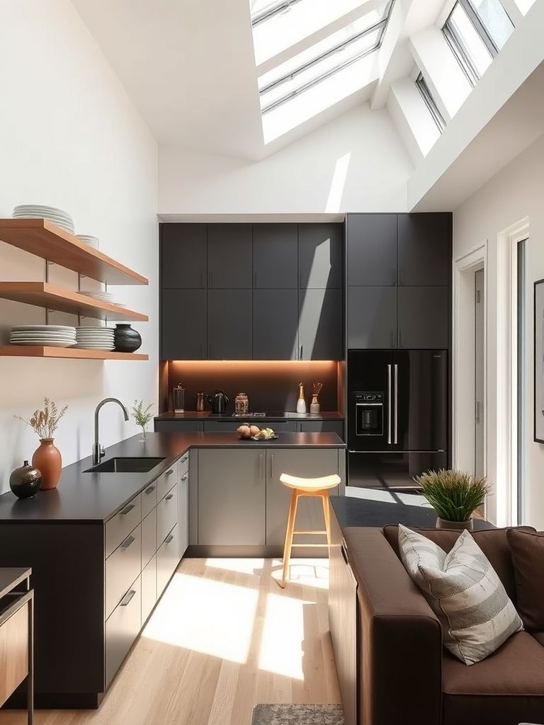
Compact Kitchen Expansion
Now, this transformation was pure genius. A couple living in a 1-bedroom apartment needed more cooking space—but knocking down walls wasn’t an option. So they went vertical. Floating shelves replaced chunky cabinets. A pull-out pantry slid behind a slim divider. And the best part? A rolling island that tucked under the counter when not in use.
They kept the color scheme simple—white and soft walnut—so the space looked wider. Adding mirrors on the backsplash? Brilliant. It reflected light and made the galley kitchen feel twice as big.
Watching them use it was like seeing a dance—every move had its place. Nothing wasted. Even the sink had a cutting board lid that doubled as prep space. It made me rethink how luxury isn’t about size—it’s about flow and function.
Convertible Multi-Use Living Space
This studio apartment blew my mind. In one corner stood a couch that turned into a guest bed. Behind a sliding wooden panel? A desk and bookshelf setup that disappeared when work ended. The dining table? Folded into the wall.
What impressed me most was how it didn’t look cluttered. Everything had a place, yet nothing felt hidden in a weird way. The ceiling had a track system that held curtains to section off areas—privacy without walls. Even lighting had zones, from warm reading bulbs to bright kitchen LEDs.
I watched the tenant fold up her entire dining area in 10 seconds flat. She said, “I entertain more now, even in 400 square feet.” That line stuck with me. Space isn’t about square footage—it’s about flexibility.
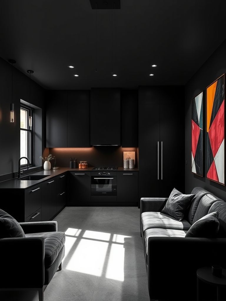
Dark & Moody Remodel Concept
When I first stepped into this remodel, it felt like entering a noir movie set. The walls were painted in deep charcoal with hints of navy, and brass accents shimmered in the shadows. It was bold—no white walls, no bright pops. Just atmosphere. I instantly felt cozy, like the room was giving me a hug.
The lighting here was key. Instead of overhead lights, there were soft-glow sconces and floor lamps with warm bulbs. Velvet curtains, matte-black cabinetry, and dark wood floors created layers of texture that absorbed light in a soothing way. Surprisingly, it never felt heavy—just grounded and intimate.
The owner—a photographer—said it helped him think better. “Bright spaces energize me, but this one calms me down,” he told me. It reminded me that not every space needs to scream for attention. Some just whisper and let you breathe.
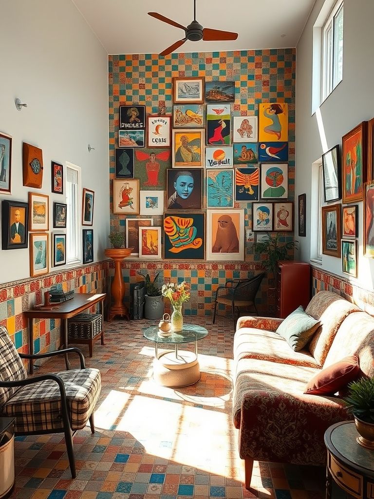
Eclectic Vintage Apartment Overhaul
Oh, this one had stories in every corner. The owner had collected pieces from flea markets, thrift stores, and travels abroad. There was a mid-century green velvet couch, a Turkish rug with wear-and-tear marks, and a retro fridge in bubblegum pink. Nothing matched—and that’s exactly why it worked.
What made this apartment pop wasn’t just the vintage items—it was the fearless mix of eras. An ornate Victorian mirror hung above a 1980s glass console. Black-and-white family portraits stood beside pop-art canvases. The clash wasn’t accidental—it was curated chaos.
I couldn’t stop looking around. Every object sparked a question. Where’s that from? What’s the story? It felt more like a gallery than a home, but lived-in and real. If you’re someone who values uniqueness over trends, this style might be your soulmate.
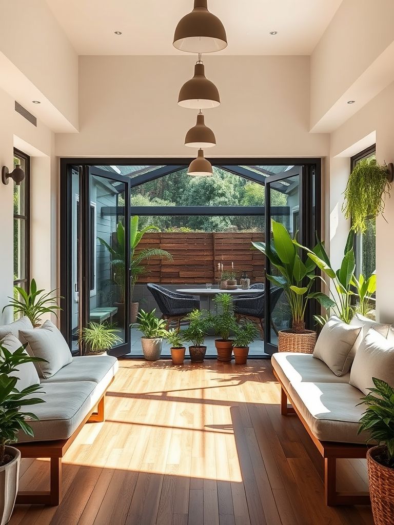
Indoor-Outdoor Balcony Integration
This tiny apartment had a cramped balcony that nobody used—until it became the highlight of the home. By installing bi-fold glass doors and leveling the floor with wooden decking, the living room now flowed into the balcony like one big airy space.
They added a swing chair, climbing plants, and sheer curtains for breeze control. A mini herb garden thrived in custom-built vertical planters. What amazed me most was how much natural light came in. It felt like the entire apartment took a deep breath.
Even during rain, the space was usable—thanks to a retractable glass canopy. The indoor-outdoor blend made everything feel lighter, fresher, and more alive. It was proof that even a 3×8 ft balcony can change how you live indoors.
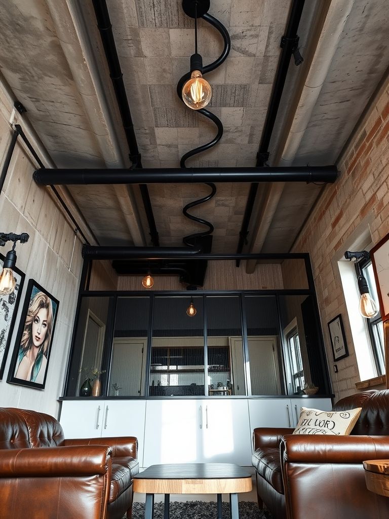
Industrial-Style Compact Remodel
This one was edgy but sleek. Picture this: exposed pipes, raw brick walls, and steel fixtures, all tucked inside a 500 sq ft apartment. It could’ve felt like a warehouse—but instead, it was a stylish bachelor pad with warmth.
The trick? Mixing materials. The designer combined metal with reclaimed wood, concrete counters with warm leather chairs. The kitchen had an open rack system with black metal frames, and Edison bulbs hung from cables in the ceiling. Even the bathroom had matte-black fittings and concrete-look tiles.
A magnetic chalkboard wall served as both art and message board. “I like my place to look unfinished—but on purpose,” the owner laughed. It wasn’t rough—it was refined grunge. It made me realize that when done right, industrial can be cozy too.
Japandi Micro-Apartment Makeover
This one was a serene blend of Japanese calm and Scandinavian simplicity. I remember walking into this 300 sq ft studio and feeling an instant sense of order. Light wood floors, white walls, and clean-lined furniture set the tone. Every object felt like it had earned its spot.
The magic? Minimalism with warmth. A futon-style bed tucked into a custom wooden platform with drawers. A small dining table that folded against the wall. Even the storage was hidden behind slatted wood panels that looked more like art than cabinets. Nothing flashy—just balanced.
The resident said, “It’s not just decor. It’s my lifestyle.” And I believed him. No clutter. Just calm. It taught me that small doesn’t mean cramped—it can be intentional, meditative, and even luxurious when done with purpose.
Luxury Marble Studio Apartment
You’d think marble would overwhelm a studio, right? That’s what I thought until I saw this space. Floor-to-ceiling Calacatta tiles in the bathroom, marble backsplash in the kitchenette, and even a marble-clad column in the corner. But paired with soft gold trims and beige upholstery—it was pure elegance.
What kept it from being cold was the texture play. Plush velvet chairs, satin curtains, and matte finishes softened the stone’s drama. A glass partition separated the bedroom area while keeping the open feel intact. Every corner glowed thanks to strategically placed LED strip lights and spotlights.
The owner called it “my little palace.” And honestly, it was. Who says you can’t bring five-star luxury into a 450 sq ft space?
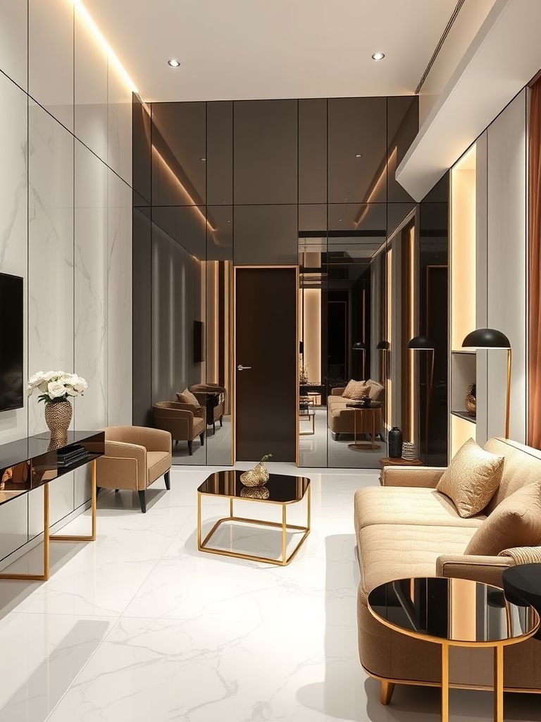
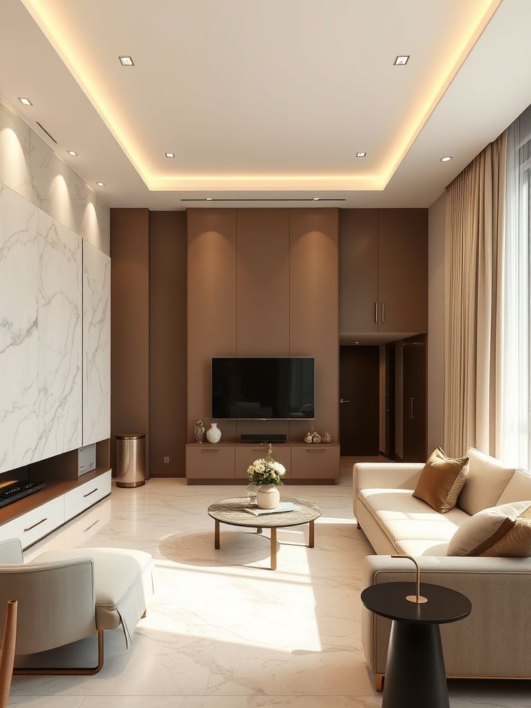
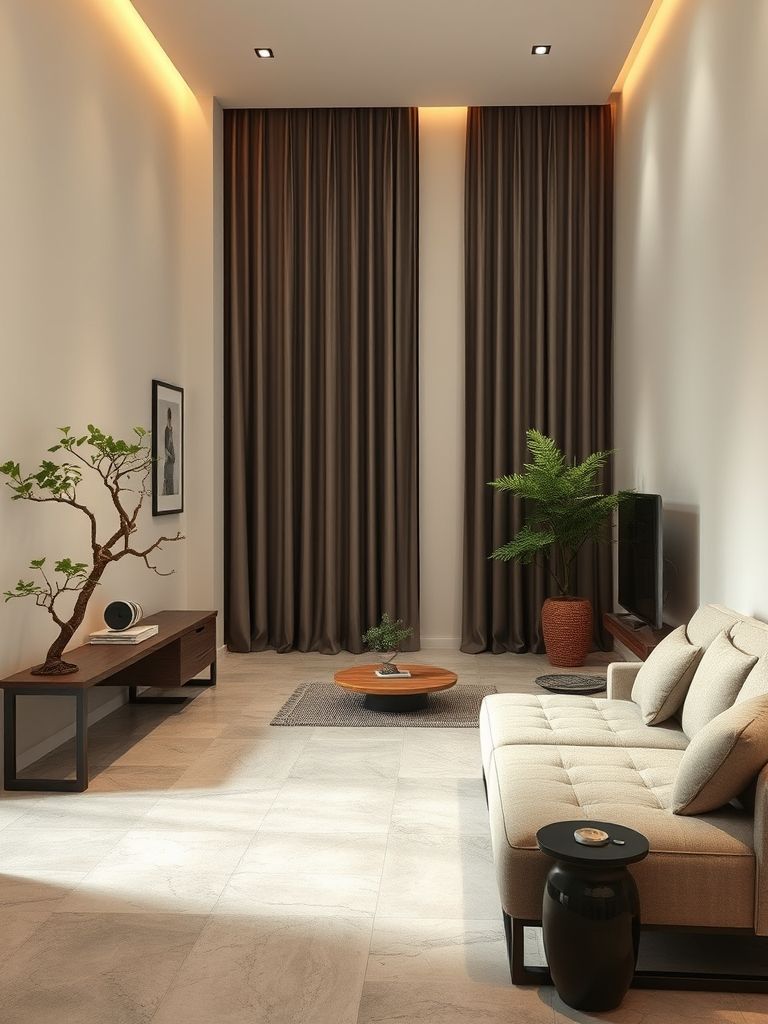
Luxury Urban Neutral Tones Remodel
This apartment felt like a luxury hotel suite but with lived-in comfort. The palette was all neutrals—taupe, beige, off-white—but never boring. Layers upon layers of fabrics, finishes, and tones created depth. Think boucle couches, linen drapes, stone countertops, and pale oak shelves.
I asked the designer how it still felt so cozy. “It’s all about contrast and softness,” she said. Smooth vs. rough, shiny vs. matte, warm vs. cool—it was like music, but with textures.
They even converted the hallway into a gallery wall with soft lighting and black frames. The living room had sculptural lighting that doubled as decor. This space whispered luxury, but without trying too hard. A true lesson in understated elegance.
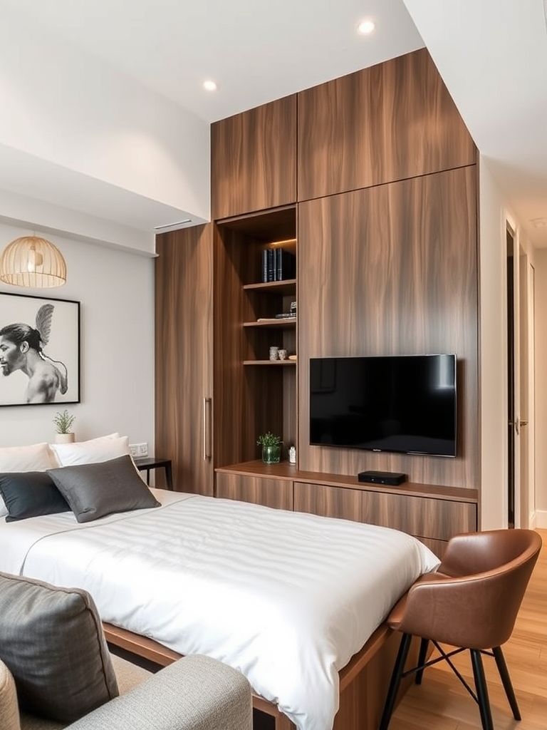
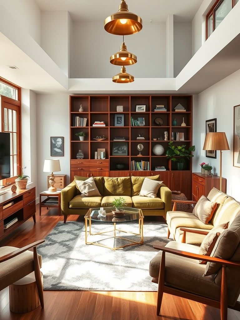
Mid-Century Modern Makeover
Ah, this one felt like stepping back into the 1960s—but with WiFi. The owner had a deep love for mid-century design, and it showed. Splayed-leg furniture, walnut paneling, mustard and teal accents—it was textbook perfect. But what made it real was the modern twist.
Instead of sticking to replicas, they paired original finds with new tech: a vintage console table held a smart speaker. The TV was framed like art. Even the kitchen, with its retro fridge, had a touch-screen induction top.
The layout focused on flow and form. Open shelves displayed collectibles, and round mirrors made the narrow hallway look wide. It was nostalgic, yes—but not a museum. It felt like home for someone who honored the past but lived in the now.
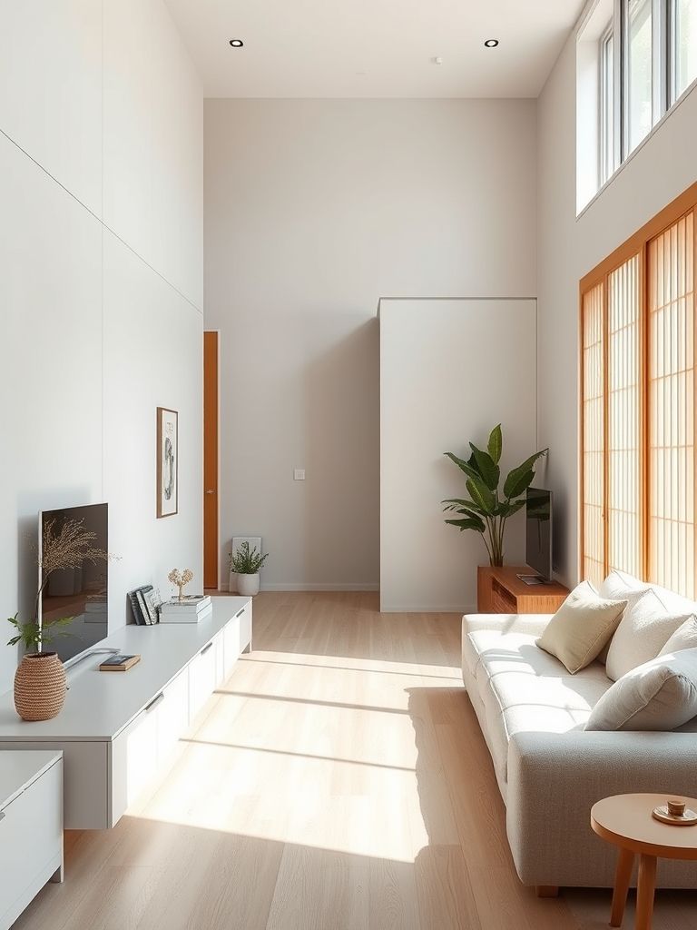
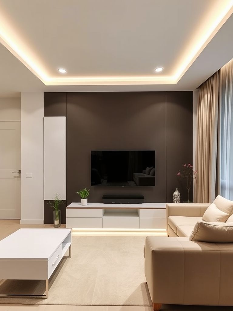
Minimalist Smart Apartment
This was tech meets tranquility. I stepped into a one-bedroom that felt like a calm retreat—until the magic started. A voice command dimmed the lights. The curtains opened themselves. Even the temperature adjusted with a tap on the phone. It was a smart home, but it didn’t look “techy.”
Design-wise, everything was ultra-minimal. White walls, slimline furniture, and barely-there hardware. The TV folded into a mirror when off. The kitchen counters had built-in charging docks and wireless induction pads. Even the bedroom had ambient lighting that shifted with time of day.
But the real highlight? Space awareness. Motion sensors lit up the hallway at night. Cupboards used sensor-based lighting. No clutter, no distractions. Just clean lines and intelligent comfort. I remember thinking, “This place doesn’t shout smart—it whispers it.”
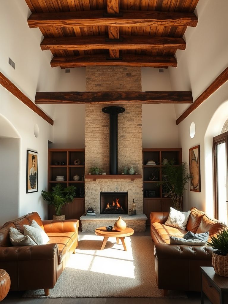
Modern Rustic Remodel with Beams
This was probably one of the coziest spaces I’ve ever been in. Wooden ceiling beams instantly gave warmth to the white space. The flooring was distressed oak, the walls were a soft plaster white, and the accents? Earthy, rustic, and heartfelt.
What I loved most was how the old met the new. They paired modern steel bar stools with a reclaimed wood island. Concrete planters sat beside macramé plant hangers. The fireplace wall was refaced with lime-wash for that raw, natural look. And those beams—they weren’t just aesthetic. They grounded the whole design.
The family who lived there cooked a lot. Their open kitchen had copper pots on display and herbs hanging to dry. It felt like an updated farmhouse tucked inside a city block. Nothing felt forced. It felt… real.
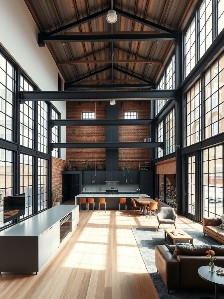
Open-Concept City Loft Remodel
This loft was an open canvas—literally. No walls. Just zones. The kitchen bled into the dining area, which faded into the living room, and behind a glass divider was the bedroom. The ceiling? Exposed concrete with ducts. The floor? Wide-plank hardwood in a warm oak.
What caught my eye was the flow. Each section had its own identity without any hard separation. Area rugs defined spaces, tall shelving units doubled as partial walls, and the lighting shifted from functional to ambient across zones.
One cool trick? The bed was on a slightly raised platform with built-in storage drawers underneath. It made the space feel multi-level without being cut off. Living in this kind of layout isn’t for everyone, but for those who love openness and light, it’s a dream.
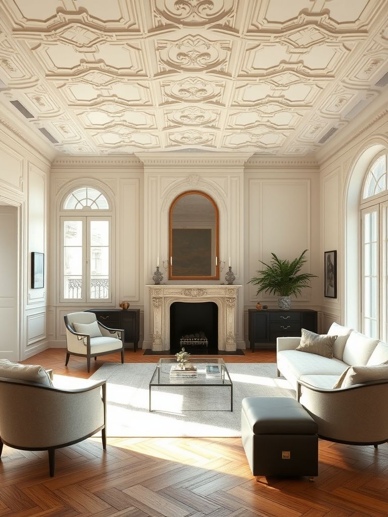
Parisian Chic Remodel
I swear, walking into this apartment felt like stepping into a movie set in Paris. Herringbone floors, ornate crown moldings, soft beige walls—it had old-world charm written all over it. But it wasn’t stuck in the past.
They mixed vintage with luxe: a gold-framed mirror leaned over a sleek white console. A marble fireplace stood beside a clear acrylic armchair. The kitchen had subway tiles and brass taps—but also a matte black smart oven. It was elegant, but not stuffy.
The color palette was mostly ivory, blush, and gray. Light flooded the space through tall windows dressed in linen. And let’s not forget the chandelier—classic, crystal, and stunning. It was the kind of place you could sip espresso in your robe and still feel glamorous.
Split-Level Studio Transformation
At first glance, this studio looked like a standard one-room setup. But then I noticed the elevation. A wooden platform split the space—bedroom on top, living area below. Just a few steps, but it created a whole new feeling of privacy and flow.
Underneath the platform? Storage galore. Drawers, cabinets, even a pull-out closet. The designer used vertical space without crowding it. A soft fabric curtain separated the bed from the rest, and clever lighting made each zone feel independent.
It didn’t feel like a tiny apartment. It felt like multiple rooms—just layered smartly. I remember thinking, “Every studio should steal this idea.” It’s functional, cozy, and surprisingly elegant for something so compact.
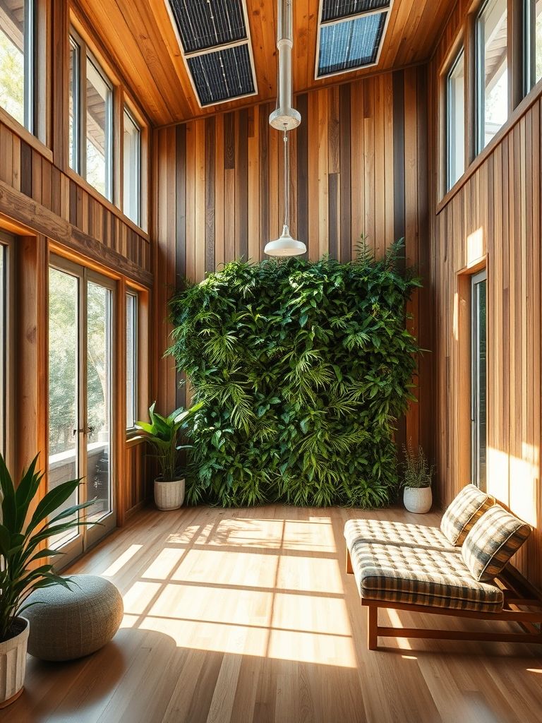
Sustainable Green Apartment Remodel
This apartment didn’t just look good—it lived responsibly. From the moment I walked in, I noticed the air felt fresher. Why? Air-purifying plants, reclaimed wood accents, and VOC-free paint. The owner was serious about sustainability, and it showed in every corner.
The kitchen had bamboo cabinets, energy-efficient appliances, and a compost drawer. The bathroom used water-saving fixtures and recycled tiles. Even the couch was second-hand—reupholstered in organic linen. There were no plastic décor items, just raw, earthy textures.
Solar panels powered parts of the unit, and thermal curtains kept cooling costs down. But the best part? Nothing screamed “eco.” It just felt peaceful, natural, and right. Style doesn’t need to come at the planet’s expense—and this place proved it beautifully.
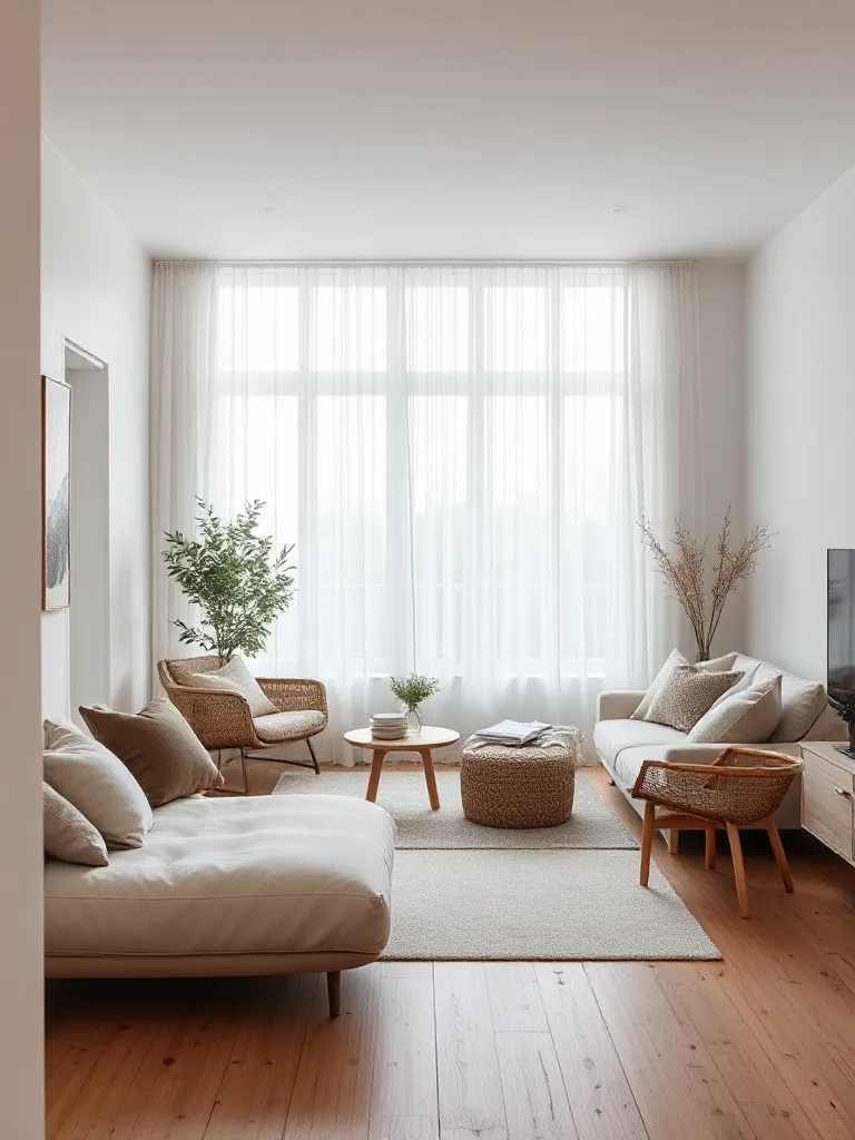
White & Wood Scandinavian Retreat
I’ve seen a lot of Scandi-style homes, but this one stayed with me. It wasn’t just pretty—it was deeply livable. Everything was white or light wood: birch, ash, beech. Even the sofa was a creamy beige with warm-toned pillows. It looked effortless.
The space maximized natural light. No heavy curtains, just airy sheers. Open shelving in the kitchen displayed handmade ceramics, while black fixtures gave just enough contrast. A jute rug grounded the living room, and soft throws made the window seat perfect for reading.
What I loved most was the calm. It wasn’t trying to impress—it was simply inviting. Even the clutter felt styled: books stacked in threes, plants in handmade pots, a wool blanket draped just right. This apartment whispered “home” in the simplest, purest way.
Zen-Inspired Apartment Redesign
This final one wasn’t flashy—but it changed my pace the moment I stepped in. Shoji-style sliding doors, floor seating, low wooden tables. The colors? Beige, taupe, moss green. The apartment didn’t just look Zen—it felt like a pause button.
A tatami platform bed, pebble garden by the entry, and minimal art created a sense of intention. No clutter, no distractions—just quiet beauty. I noticed how the layout flowed with soft edges, not hard corners. Even the lights mimicked candle flickers.
The tenant told me, “I wanted a place where I can breathe.” Mission accomplished. Sometimes, the most powerful designs aren’t about more—they’re about less, done right.
🌿 Final Thoughts
After experiencing all 20 spaces, one thing became clear to me: there’s no “right” way to design a home. Whether you love bold colors, neutral palettes, vintage vibes, or cutting-edge tech—there’s room for your story in every square foot. These apartments weren’t about following trends. They were about reflecting the people who lived in them.