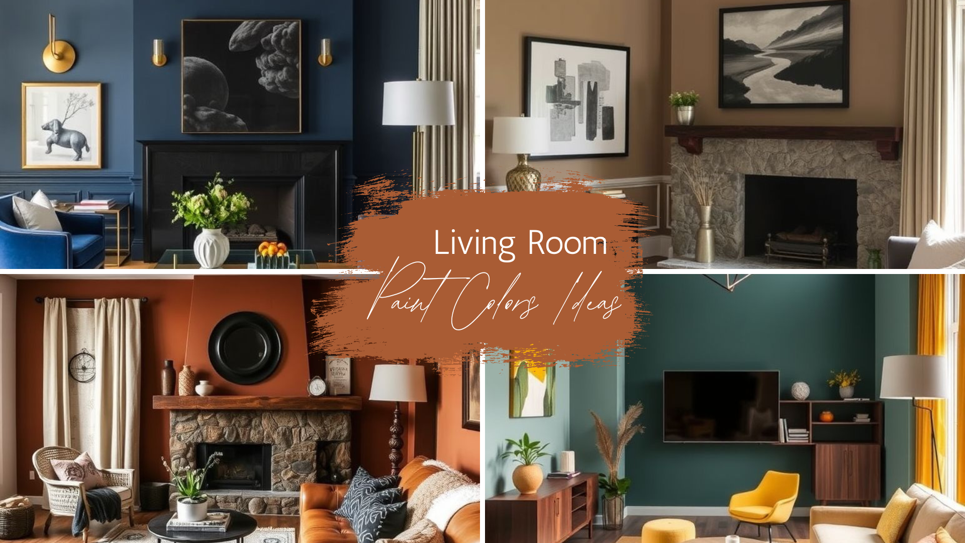
Living Room Paint Colors Ideas for Every Style
An accent wall can shift the mood of a room without a full renovation. The right shade draws attention, defines a focal point, and adds depth. Choosing the right tone can make the space feel larger, cozier, or more vibrant.
In this guide, I’ll share 20 accent wall color ideas you can use in your home. Each color has a unique personality and works well with specific decor styles. From rich, dramatic hues to soft, calming shades, you’ll find plenty of inspiration here.
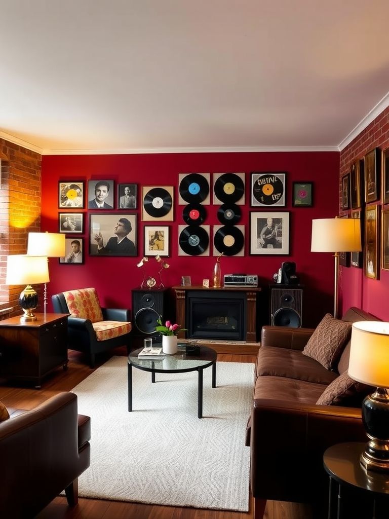
1. Brick Red for Bold Vintage Flair
Brick red creates a warm and nostalgic atmosphere in any room. It pairs beautifully with aged wood, patterned rugs, and classic brass details. Natural light highlights its richness, while evening light makes it feel intimate and cozy.
This shade works best in living rooms, dining spaces, or home libraries. It’s especially effective in rooms with traditional or vintage-style furniture. Add warm metallic accents to complete the old-world charm.
2. Clay Beige for Subtle Luxury
Clay beige offers an elegant, understated backdrop that suits many styles. Its earthy warmth pairs well with textures like linen, wool, and jute. The color blends seamlessly with both light and dark furnishings.
It’s a versatile choice for bedrooms, living rooms, or open-plan spaces. The tone helps create a soft, welcoming feel without dominating the decor. Pair with natural wood for a grounded, calming effect.
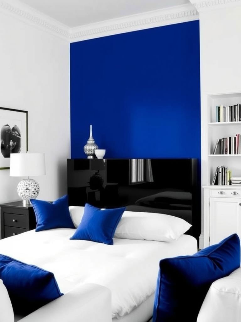
3. Cobalt Blue Pop in a Monochrome Room
Cobalt blue brings life to a simple monochrome space. It adds vibrancy without overwhelming the other elements in the room. This bold hue catches the eye and energizes the atmosphere instantly.
Balance the intensity with soft grays or crisp whites. Adding metallic accents can make the look feel refined and modern. Use in creative spaces, dining areas, or hallways for a lively touch.
4. Creamy White with Pale Olive Trim
Creamy white offers a fresh, clean base for many interiors. The pale olive trim adds character without clashing or overpowering the scheme. Together, they create a soft and harmonious look.
This combination works in kitchens, entryways, and home offices. Adding plants will enhance the natural feel of the palette. Include light wood tones for a balanced, airy finish.
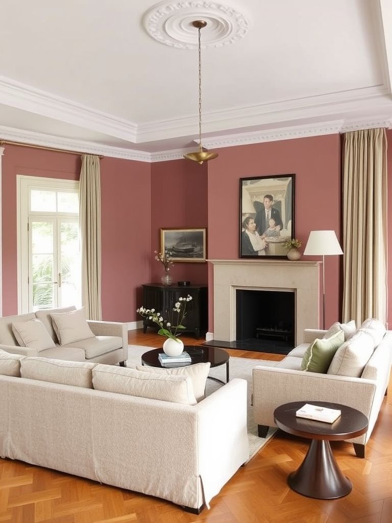
5. Dusty Rose with Warm Neutrals
Dusty rose adds softness and a gentle romantic feel. When paired with warm neutrals like beige and taupe, it creates a balanced, inviting space. The shade works especially well in intimate areas.
Bedrooms, reading nooks, and cozy lounges benefit from its charm. Add plush fabrics and warm lighting for a layered, comfortable effect. This color combination offers a calm yet stylish atmosphere.
6. Greige for Modern Simplicity
Greige blends the warmth of beige with the coolness of gray. It creates a versatile base that works with almost any decor style. This shade is perfect for homeowners who want a neutral that feels fresh.
It works well in living rooms, kitchens, and open-plan areas. Pair it with black accents for contrast or soft pastels for a gentle look. The result is modern, simple, and timeless.
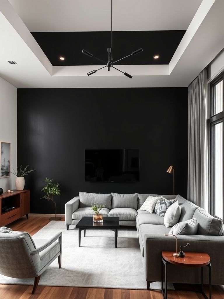
7. Matte Black Feature Wall for Drama
Matte black adds instant depth and sophistication to a space. It works best in rooms with good natural light to prevent it from feeling closed in. The finish gives a smooth, contemporary look.
Pair with crisp white for a striking contrast or warm metals for a glamorous edge. It’s ideal for feature walls in living rooms or dining spaces. Use minimal decor to keep the drama focused.
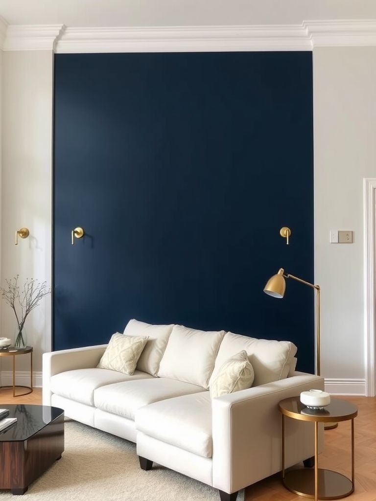
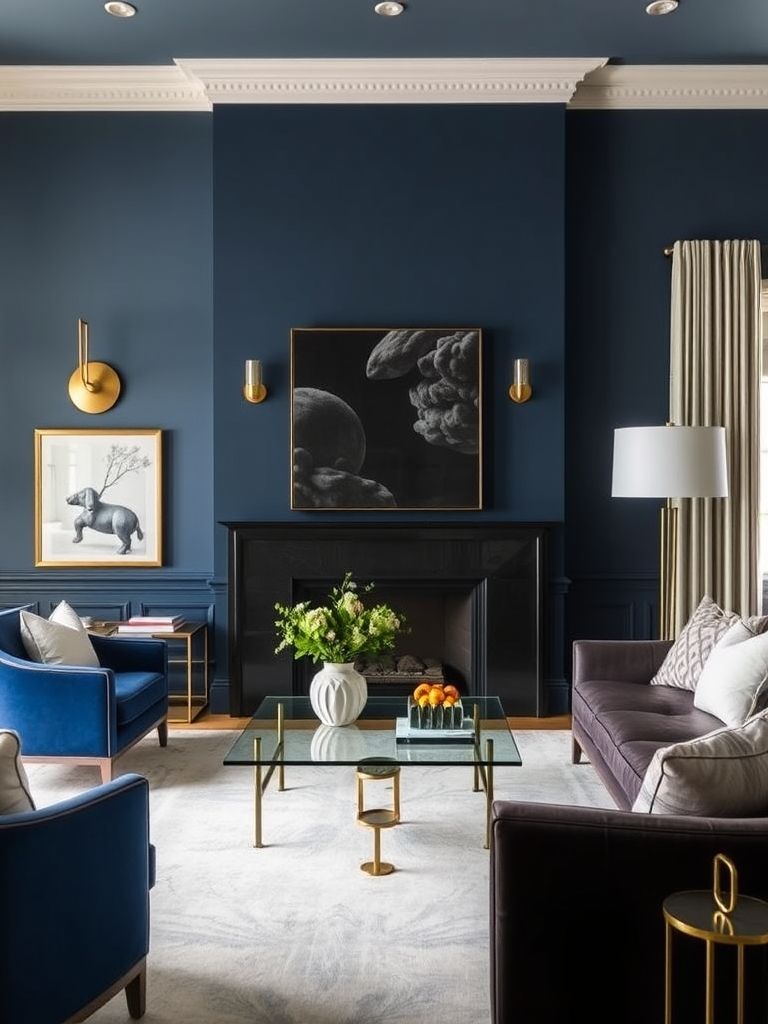
8. Midnight Blue Accent Wall with Cream Palette
Midnight blue brings richness and a calming presence to interiors. When paired with cream, it creates a classic and balanced color scheme. The contrast feels elegant without being too bold.
This combination is ideal for bedrooms, formal lounges, or studies. Adding gold or brass accents enhances the luxurious vibe. Soft lighting helps bring out the depth of the blue.
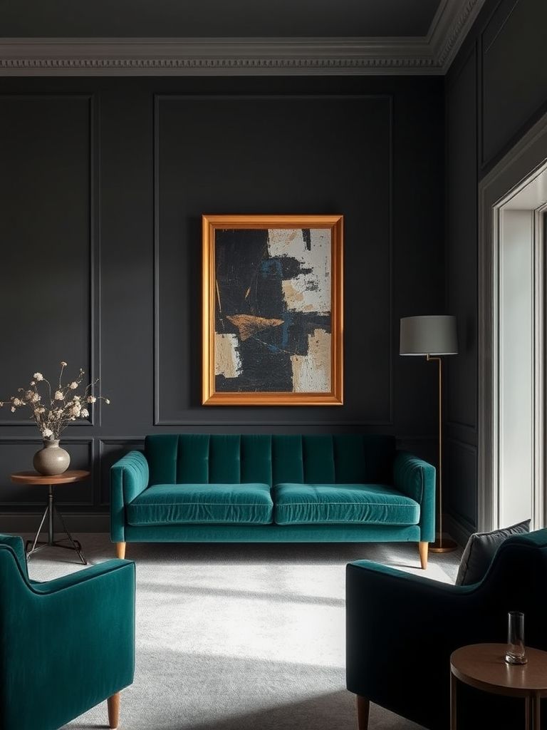
9. Moody Charcoal for a Sophisticated Edge
Charcoal adds depth and an air of modern refinement. It’s a great choice for anyone who wants a moody yet versatile color. The tone adapts well to both sleek and rustic styles.
It works beautifully in home offices, living rooms, and entryways. Pair it with light wood or crisp white for balance. The result is a sophisticated and polished look.
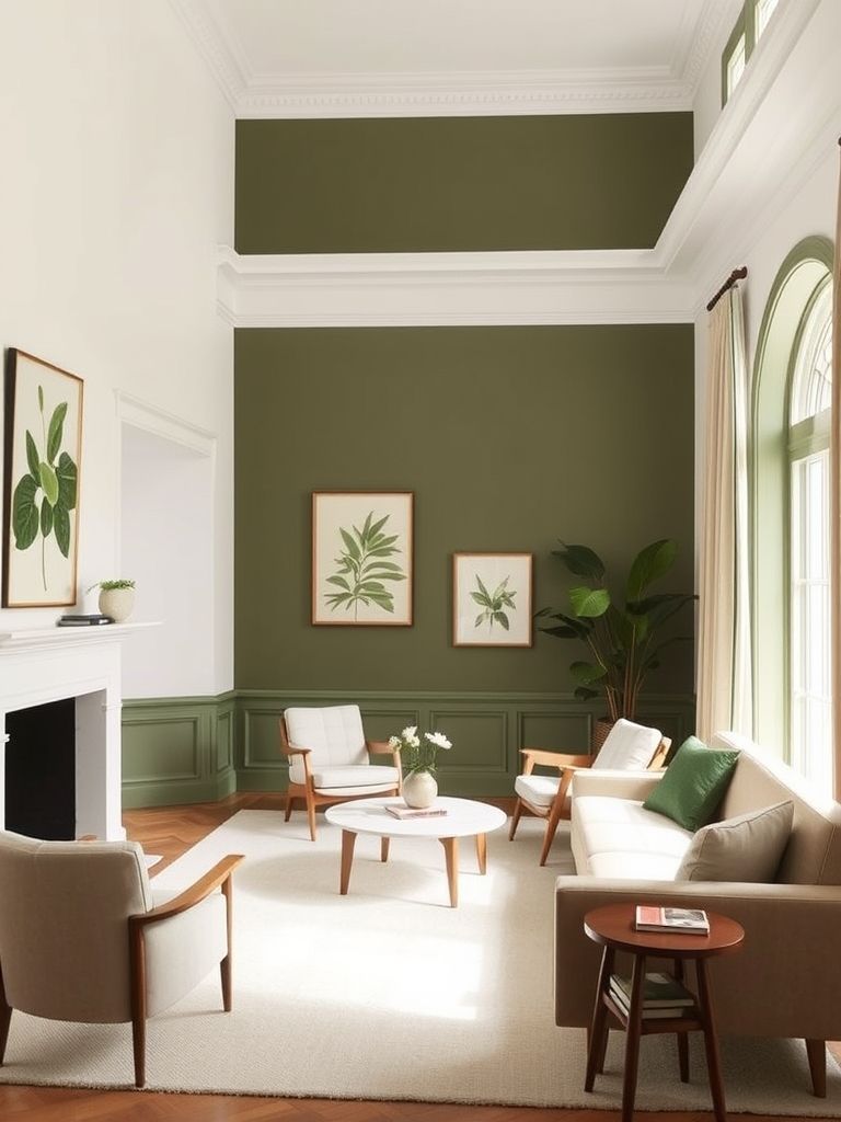
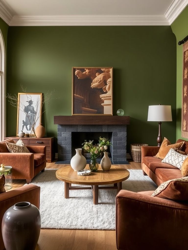
10. Moss Green Paired with Earthy Browns
Moss green connects your home to nature. When paired with earthy browns, it creates a grounded and warm atmosphere. This combination feels especially inviting in common spaces.
It’s perfect for living rooms, dining areas, or entry halls. Adding plants will enhance the natural vibe of the color scheme. Use warm lighting to bring out the richness of both shades.
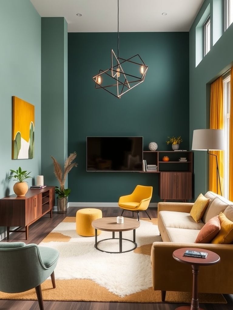
11. Muted Teal for a Balanced Mid-Century Look
Muted teal offers a calm yet lively tone that fits mid-century design perfectly. It pairs beautifully with warm wood finishes and vintage-style furniture. The color feels fresh without being overpowering.
Use it in living rooms, dining areas, or home offices. Adding geometric patterns will enhance the retro charm. Warm metallics like brass can bring extra depth to the scheme.
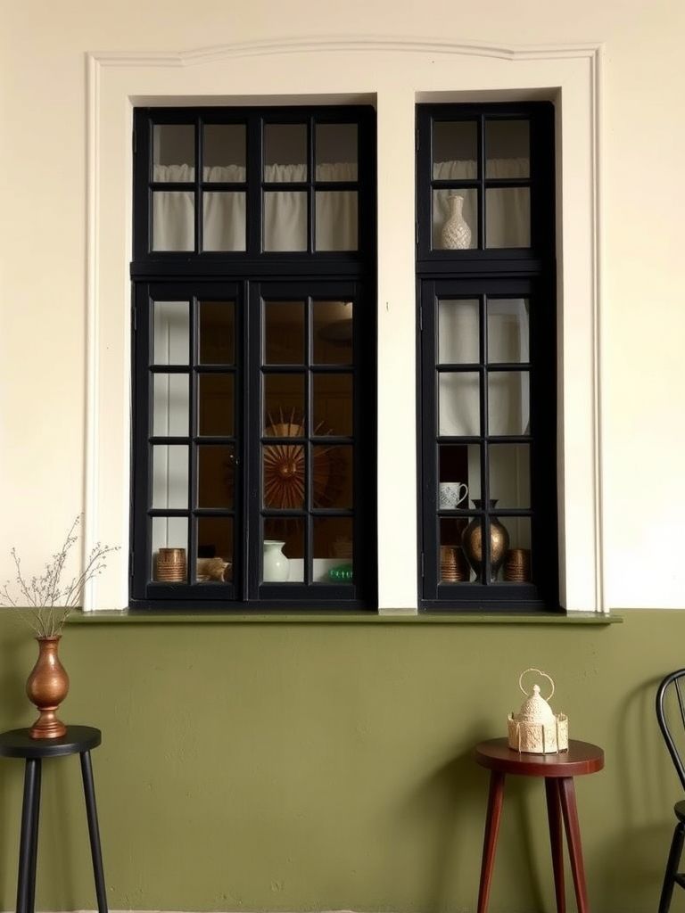
12. Olive Green and Cream Duo-Tone Walls
Olive green adds richness, while cream keeps the space light and open. The duo-tone effect gives dimension and visual interest to plain walls. It’s a stylish choice for modern and classic interiors.
This pairing works well in kitchens, hallways, and bedrooms. Adding natural textures like rattan or linen enhances the warmth. It’s a fresh and adaptable color combination for many spaces.
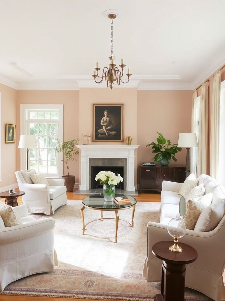
13. Pale Peach and White for Airy Elegance
Pale peach brings a soft glow to interiors. Combined with white, it creates a fresh and uplifting feel. This pairing works especially well in rooms that receive natural light.
It’s perfect for nurseries, bedrooms, or sunrooms. Adding light wood furniture can enhance the airy vibe. Soft fabrics complete the gentle and elegant look.
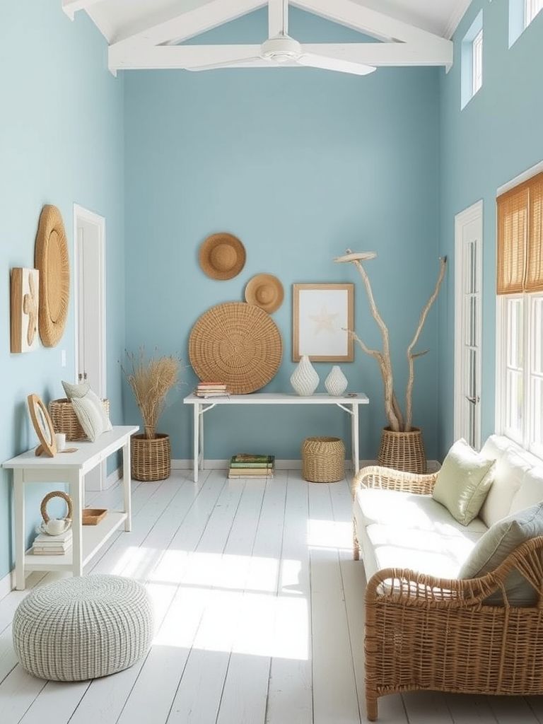
14. Powder Blue for a Soft Coastal Feel
Powder blue instantly brings a sense of calm. Its light, airy nature makes it perfect for coastal-inspired interiors. Pairing it with sandy beige or crisp white enhances the beachy feel.
This color is great for bathrooms, bedrooms, and relaxed living spaces. Adding natural textures like woven rugs or driftwood works well. The result is a serene and refreshing atmosphere.
15. Slate Blue with Brushed Gold Highlights
Slate blue offers a sophisticated yet soothing presence. Brushed gold accents add a touch of understated luxury. The combination feels refined without being too formal.
It’s well-suited for bedrooms, dining rooms, or home offices. Layering soft fabrics and warm lighting brings out the richness of both tones. This pairing works beautifully in both modern and classic settings.
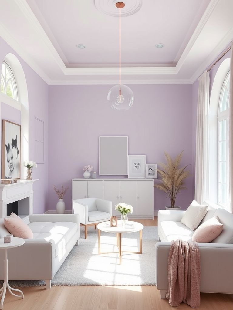
16. Soft Lilac for Subtle Whimsy
Soft lilac adds a playful yet gentle charm to interiors. It’s light enough to feel airy while still adding personality. The shade works well in creative and relaxing spaces alike.
Use it in bedrooms, craft rooms, or reading corners. Pair it with white or pale gray for a calm balance. Light wood accents help keep the look warm and inviting.
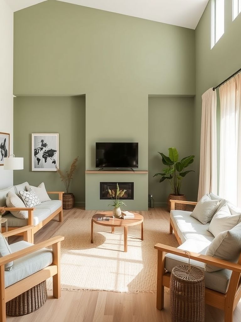
17. Soft Sage for a Calm, Natural Vibe
Soft sage offers a soothing, nature-inspired feel. Its muted green tone works beautifully with neutral decor and natural textures. The result is a peaceful and harmonious environment.
This shade is ideal for bedrooms, kitchens, or home offices. Add woven baskets, linen fabrics, and wood furniture to enhance the organic look. Soft lighting will make the space feel even cozier.
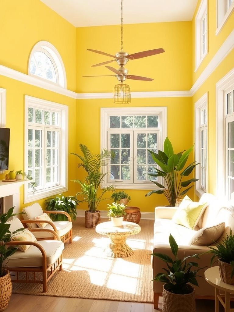
18. Sunbeam Yellow for an Uplifting Space
Sunbeam yellow fills a room with warmth and cheer. It’s bright without being too overpowering, making it perfect for lively spaces. The shade works well with crisp whites or warm wood tones.
Use it in kitchens, dining rooms, or creative studios. Pair with minimal patterns to keep the focus on the color. It’s a great way to energize a space instantly.
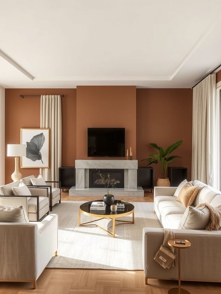
19. Terracotta Walls for Cozy Warmth
Terracotta brings an earthy, inviting feel to interiors. Its warm tones create a sense of comfort and charm. This color works beautifully with rustic or Mediterranean-inspired decor.
It’s perfect for living rooms, sunrooms, or dining spaces. Pair with natural textures like clay pottery, rattan, or wood furniture. Soft, warm lighting will enhance the coziness.

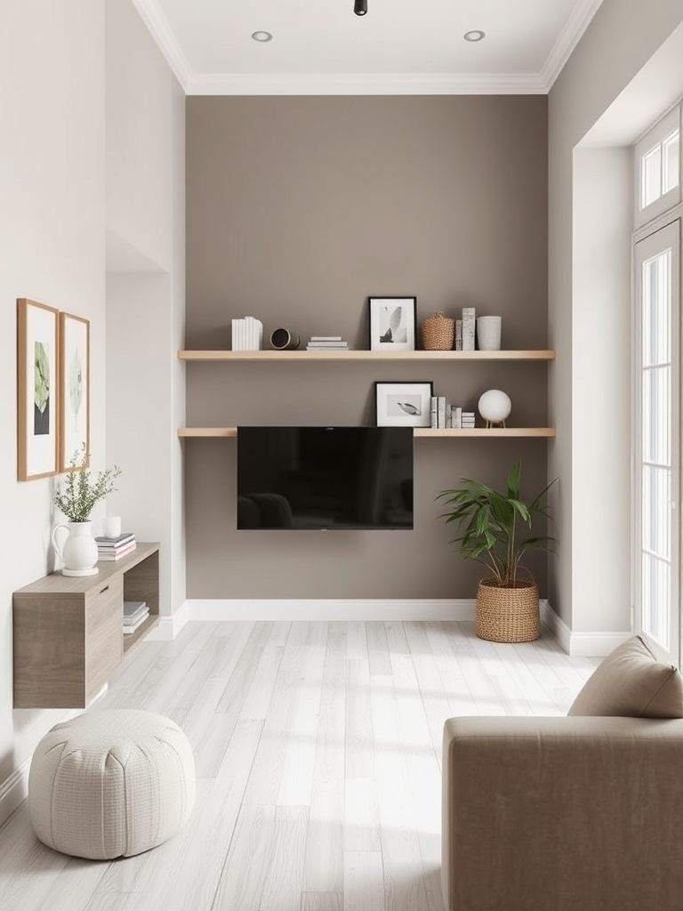
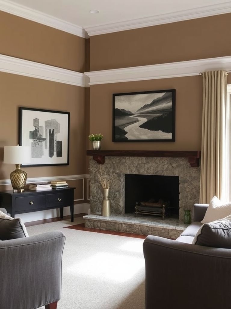
20. Warm Taupe for Timeless Versatility
Warm taupe offers a classic, adaptable backdrop. It blends well with both modern and traditional styles. This neutral shade is easy to pair with a variety of colors.
Use it in any room, from bedrooms to living spaces. Layer with different textures to add depth to the design. Its timeless quality makes it a reliable choice for long-term appeal.
Conclusion on Living Room Paint Colors Ideas
Choosing the right accent wall color can instantly change the mood of a room. From bold reds to calming sages, each shade has the power to define your space. Pair your chosen color with the right textures and lighting for the best effect.