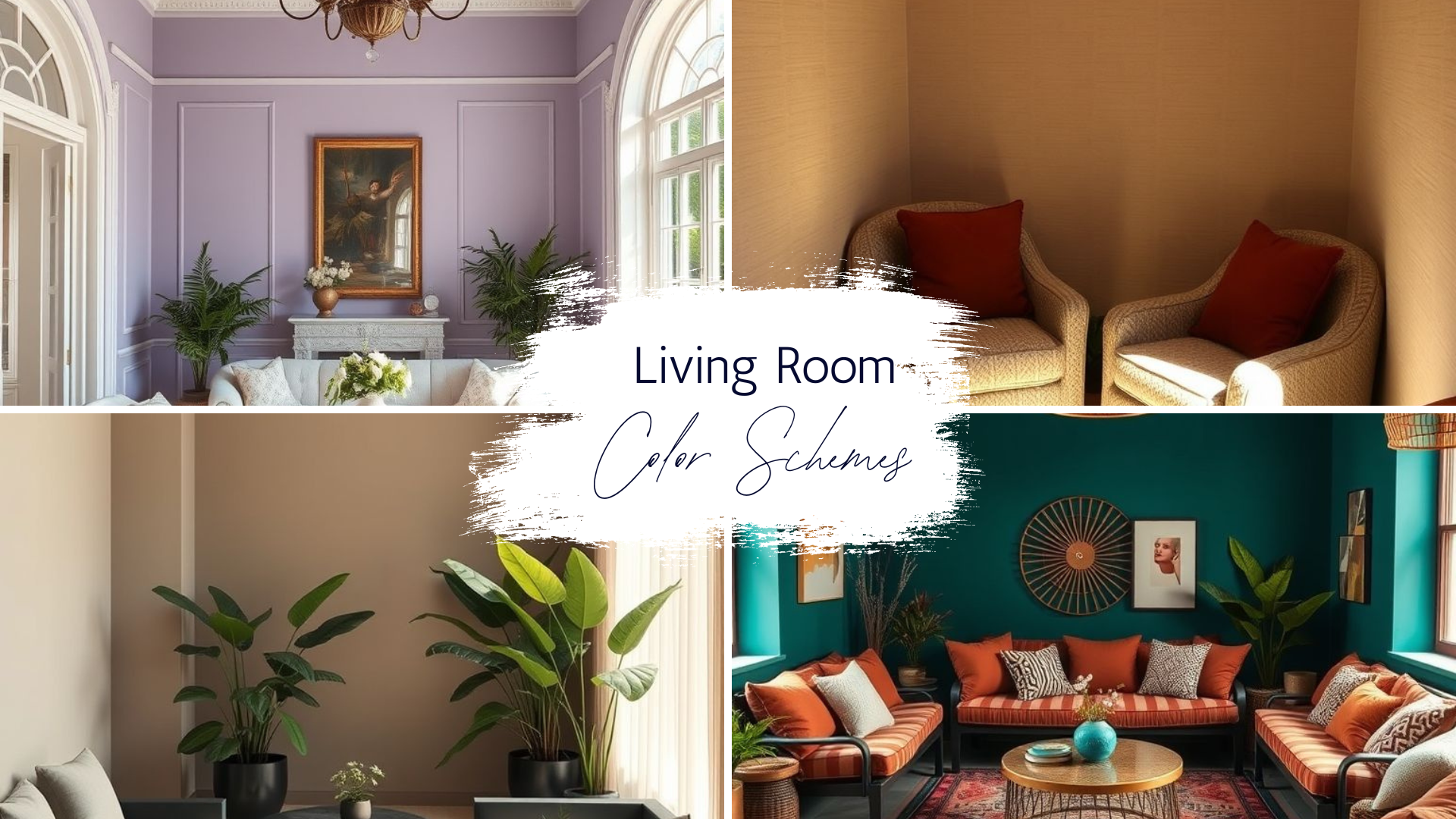
Living Room Color Combinations – 20 Stylish Ideas for Every Home
I’ve always believed that the right mix of colors can change the entire mood of a living space. Over the years, I’ve seen rooms go from plain to personality-filled simply by rethinking the palette. It’s not just about what looks pretty — it’s about creating an atmosphere that feels right every time you walk in.
When I step into a room, the first thing I notice is how the colors speak to each other. Some palettes whisper calm, others burst with energy. And then there are those rare combinations that strike the perfect balance between warmth and sophistication.
In this guide, I’m sharing twenty living room color combinations I’ve personally found to be unforgettable. Each one has a story, a feeling, and a purpose. They’re not just trends — they’re timeless arrangements that can suit different personalities and lifestyles.
I’ve included combinations that work for small apartments, spacious homes, urban lofts, and cozy corners. Some lean toward minimalism, while others embrace bold statements. What they all have in common is their ability to turn a room into a place you want to linger.
Every section here comes from what I’ve observed, tested, or recommended to clients and friends. These aren’t random ideas — they’re color harmonies I’ve seen come alive in real spaces. So, let’s start exploring the shades that can redefine your living room.
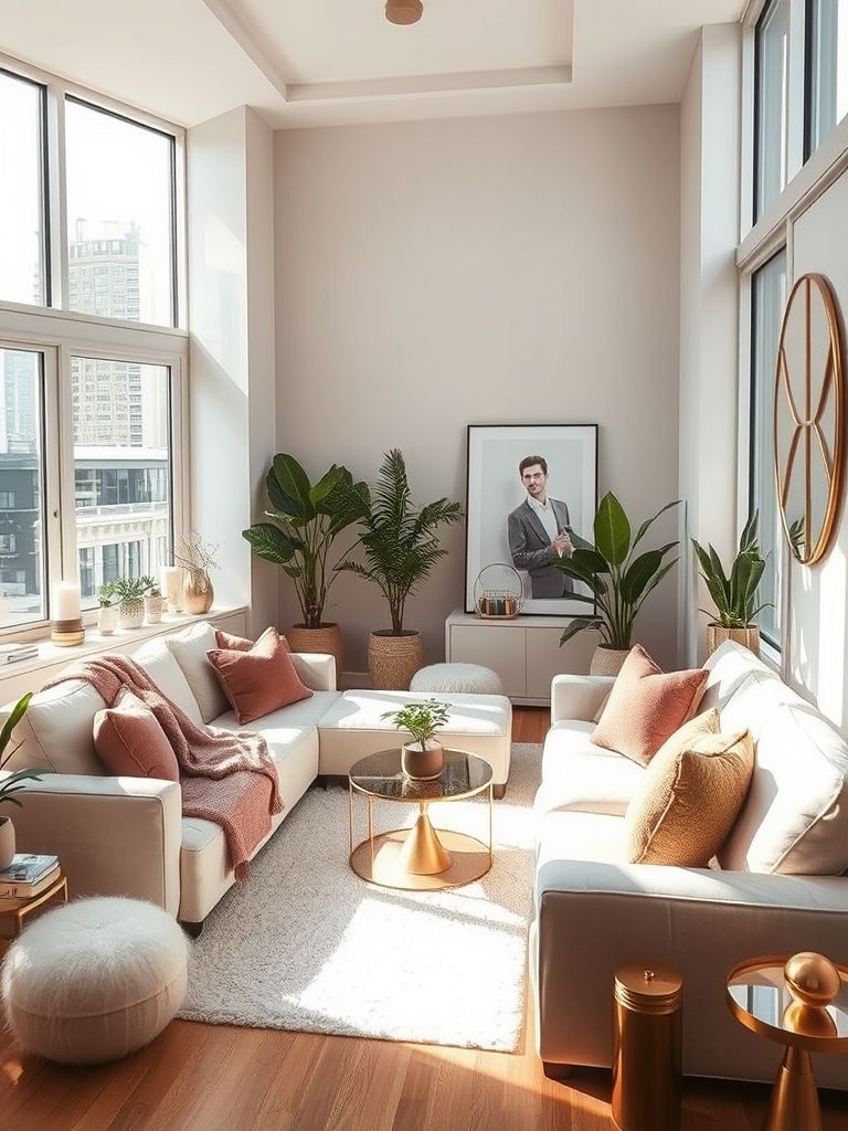
Blush Pink and Soft Taupe Harmony
The first time I saw blush pink paired with soft taupe, it was in a small Parisian apartment overlooking a quiet street. The walls had this muted taupe tone, warm but not overpowering, and the sofa in a pale blush seemed to soften every edge of the room. It felt inviting, as if the space wanted you to relax without even thinking about it.
Blush pink works beautifully as a gentle accent because it’s not overly sweet. When paired with taupe, it gains a grounded feel that keeps the room from looking overly delicate. I’ve noticed this palette works especially well in spaces where you want a calm but subtly romantic atmosphere. Lighting plays a huge role in how this combination comes across. In natural daylight, blush tends to look fresher, while taupe warms up under evening lamps. That shift throughout the day adds a living quality to the space, keeping it from feeling static.
I’ve also experimented with adding texture here. A velvet blush armchair next to a matte taupe wall creates depth without needing more color. Throw in a woven rug or linen curtains, and the room gains that layered, lived-in appeal. For those who want to keep things airy, keeping taupe on larger surfaces like walls or a sectional sofa, and blush in accents like cushions or artwork, works well. This way, the blush becomes a highlight rather than the main character.
One detail I often recommend is metallic accents. A brushed gold lamp or a champagne-toned picture frame brings out the warmth in both colors, tying the palette together. Just don’t go overboard — the beauty of this mix lies in its subtlety. This is the kind of color harmony that works year-round. It’s soft enough for spring, warm enough for autumn, and neutral enough to adapt as trends shift. Every time I see it in a new setting, it reminds me why I keep coming back to it.
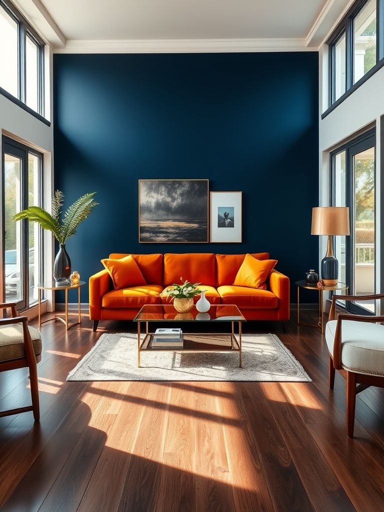
Bold Navy and Burnt Orange Contrast
I remember walking into a loft in downtown Chicago where this pairing stopped me in my tracks. The owner had painted one wall in a deep navy, so rich it almost absorbed the light, while a burnt orange leather sofa sat confidently against it. The combination had an instant presence — bold without shouting, warm without feeling heavy.
Navy is one of those colors that always brings stability to a room. It’s sophisticated, dependable, and works with almost every style. Burnt orange, on the other hand, adds an earthy vibrancy that can break up the seriousness of navy. Together, they create this balance of grounded depth and uplifting energy.
I’ve seen this pairing work especially well in open-plan living spaces. Navy on a feature wall anchors the area, while orange accents — maybe in armchairs, cushions, or an abstract rug — guide the eye through the rest of the room. It gives each area a sense of place without the need for walls or partitions.
Lighting again makes a huge difference here. Daylight brings out the blue’s coolness and makes the orange pop, while evening light softens the contrast into something cozier. I like using warm LED lighting to enhance that evening glow, especially in reading corners or near seating areas.
Texture is your best friend with this palette. A smooth navy wall against the rich grain of orange-toned wood can be stunning. Or a matte navy sofa with a velvet burnt orange throw can turn a simple seating area into a statement piece.
Accessories can subtly reinforce the theme. Brass or aged gold frames tie beautifully into the warmth of burnt orange, while deep blue ceramics or patterned cushions help repeat the navy across the room without overwhelming it.
This is a combination I’ve recommended to people who want their living room to feel both confident and welcoming. It has the strength to stand out but enough warmth to make guests feel at home. Every time I’ve seen it done well, it leaves a lasting impression.
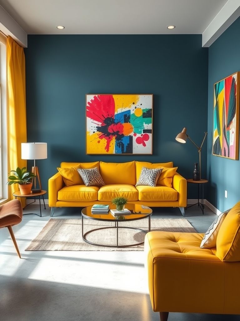
Canary Yellow and Slate Blue Modern Pop
The first time I saw canary yellow and slate blue together, it was in a city apartment that looked like it belonged in a design magazine. The slate blue walls set a calm, contemporary base, while splashes of canary yellow — in the form of chairs, artwork, and even a floor lamp — brought the space to life. It felt modern, playful, and surprisingly easy on the eyes.
Canary yellow is energetic without being overly bright when used in the right amount. Against slate blue, it becomes a highlight rather than a distraction. This balance works well if you’re aiming for a space that feels cheerful but still grounded.
One thing I’ve noticed with this combination is that proportion matters. Too much yellow can overwhelm, while too much blue can feel cold. I like to keep blue as the dominant tone — perhaps on the walls or a large sofa — and let yellow act as an accent in smaller, repeatable doses.
Textures make a big difference here. A matte slate blue wall paired with glossy yellow ceramics, for example, creates visual depth. Or a soft blue rug under a yellow coffee table can bring warmth to the floor area without clashing.
Lighting choices can enhance the overall effect. Cool daylight bulbs make the yellow pop against the blue, while warmer tones create a softer, more inviting contrast. In one project, I even used a yellow glass pendant light over a dining table, which cast a gentle golden glow without overpowering the room.
Accessories tie the look together effortlessly. A blue-and-yellow patterned cushion, a ceramic vase, or even a throw blanket can carry the palette through the space. I’ve also found that natural wood accents work beautifully here, adding a neutral element that harmonizes with both colors.
This pairing is ideal for anyone who wants a room that feels modern but still has personality. It’s the kind of look that makes people smile when they walk in — and that’s a hard thing to achieve with just two colors.
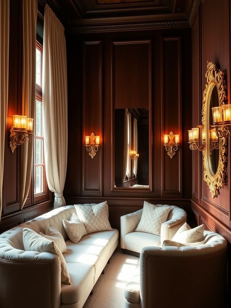
Chocolate Brown and Ivory Luxe Retreat
I once visited a countryside home where the living room felt like a warm embrace the moment I stepped in. The walls were painted in a deep chocolate brown, and the ivory furnishings brought just the right amount of light into the space. It was a perfect blend of richness and calm — the kind of place you could happily spend an entire afternoon in.
Chocolate brown is naturally grounding. It brings depth and a sense of security to a room, making it feel more intimate. Ivory, on the other hand, opens the space and adds a clean elegance that keeps darker tones from feeling heavy. Together, they strike an inviting balance that works year-round.
This combination shines when paired with layered textures. I’ve seen wool throws, linen curtains, and velvet cushions all playing together in this palette without clashing. The ivory picks up light, while the brown absorbs it, creating a dynamic interplay that changes with the time of day.
Lighting is especially important here. Warm lighting enhances the cozy, retreat-like feeling, while natural light makes the ivory glow against the brown backdrop. I’ve even seen candlelight work wonders in such spaces, adding a soft flicker that deepens the warmth.
In terms of accessories, metallics like bronze or brushed gold add sophistication without stealing attention. A coffee table with a walnut finish and ivory marble top, for instance, can tie the look together effortlessly.
For floors, I often suggest a warm wood tone that complements the brown walls, layered with an ivory or cream rug for contrast. This grounds the room while keeping it visually balanced.
Whenever I recommend this pairing, it’s for someone who wants their living space to feel like a sanctuary — refined yet undeniably comfortable. It’s a timeless combination that never feels dated.
Cool Greys and Sky Blue Urban Style
In a high-rise apartment overlooking the city, I saw this palette come alive. Cool grey walls set a sleek, modern tone, while sky blue accents brought in a light, airy feel. It was the perfect mix of urban sophistication and relaxed comfort.
Cool grey has a way of making a space feel fresh and contemporary without being stark. Sky blue softens that edge, introducing a touch of calm that keeps the room from feeling too formal. Together, they create a space that feels organized yet approachable.
This combination works particularly well with clean-lined furniture and minimal clutter. A grey sectional sofa with sky blue cushions instantly makes the seating area more inviting, while still keeping a modern aesthetic.
I’ve noticed that natural materials like light oak or pale stone fit beautifully into this palette. They add warmth without competing with the main colors. In one project, a pale wood coffee table became the perfect bridge between the cool greys and soft blues.
Lighting can push the style in different directions. Cooler-toned LEDs amplify the sleek, modern vibe, while warmer bulbs make the blue feel more coastal and relaxed. This versatility means the palette works in both city lofts and suburban homes.
Textures are a must to keep it from feeling flat. Think soft blue rugs, woven grey throws, and even glass decor pieces to reflect light. Subtle metallics like chrome or brushed steel can also enhance the urban feel.
This pairing is a safe choice for those who want a modern living room without sacrificing comfort. It’s easy to live with, easy to style, and works with a variety of furniture and accessories over time.

Coral and Ice Grey Scandinavian Contrast
I once styled a compact studio where coral and ice grey became the perfect pairing. The pale grey walls acted like a cool, neutral canvas, while coral accents brought in a burst of warmth and personality. It was cheerful without being overpowering, just what the space needed.
Ice grey has that soft, Scandinavian feel that instantly makes a room look clean and airy. Coral, with its mix of pink and orange undertones, adds just enough vibrancy to keep things from feeling too minimal. Together, they create a balance of freshness and energy.
In Scandinavian-inspired spaces, this palette works beautifully with natural elements. Light wood floors, woven baskets, and soft textiles help ground the coral so it doesn’t overpower the room.
Lighting is key here — natural daylight keeps the coral looking crisp, while warm evening lighting brings out its cozy side. I like adding a coral-toned throw or a patterned rug to make the palette feel layered without overdoing it.
For accessories, simple lines and uncluttered arrangements are best. Coral pottery, minimalist art prints, or a single statement chair can carry the color without making the space feel busy.
This combination suits anyone who loves the airy, minimal style of Scandinavian interiors but still wants a touch of boldness. It’s proof that minimal doesn’t have to mean colorless.
Earthy Neutrals with Terracotta Accents
I’ve seen terracotta come back into interiors in such a big way, and pairing it with earthy neutrals is one of my favorite approaches. The soft beiges, creams, and sandy tones create a calm foundation, while terracotta adds warmth and depth.
This palette has an undeniably natural feel. It reminds me of sunbaked clay and soft stone — timeless and grounded. It works especially well in living rooms where comfort and a sense of connection to nature are priorities.
Layering is essential here. Think linen curtains, wool throws, and textured cushions. Terracotta in a velvet or ceramic finish adds a richness that contrasts beautifully with the matte textures of neutrals.
Natural light is the best friend of this palette, highlighting the warm undertones in both the neutrals and the terracotta. In low-light spaces, I’ve used soft, amber-hued bulbs to keep the earthy warmth intact. Accessories like clay vases, woven baskets, and wooden furniture reinforce the organic feel. A terracotta planter with lush greenery can be the perfect finishing touch. This combination feels timeless because it draws directly from nature. It’s adaptable, calming, and always inviting.
Forest Green and Soft Peach Modern Earth Tones
I once helped a client transform their formal living room into something more relaxed by using forest green and soft peach. The deep green anchored the space, while the peach brought a gentle warmth that kept it from feeling heavy.
Forest green is rich and dramatic, often associated with nature and stability. Soft peach offers a friendly, almost sunlit glow that complements green’s depth. Together, they make the room feel both grounded and welcoming.
This combination works especially well with mixed materials. A green velvet sofa with peach cushions feels luxurious, while painted green cabinetry with peach-toned art adds a modern twist.
Lighting shifts this palette significantly. Daylight makes the peach feel fresher, while evening lighting enriches the green tones for a cozier effect. For accessories, metallic gold or brass add elegance without overshadowing the main colors. I’ve also found that dark wood furniture works well here, tying in naturally with the forest green. This pairing is perfect for anyone who wants their space to feel contemporary while still connected to nature.
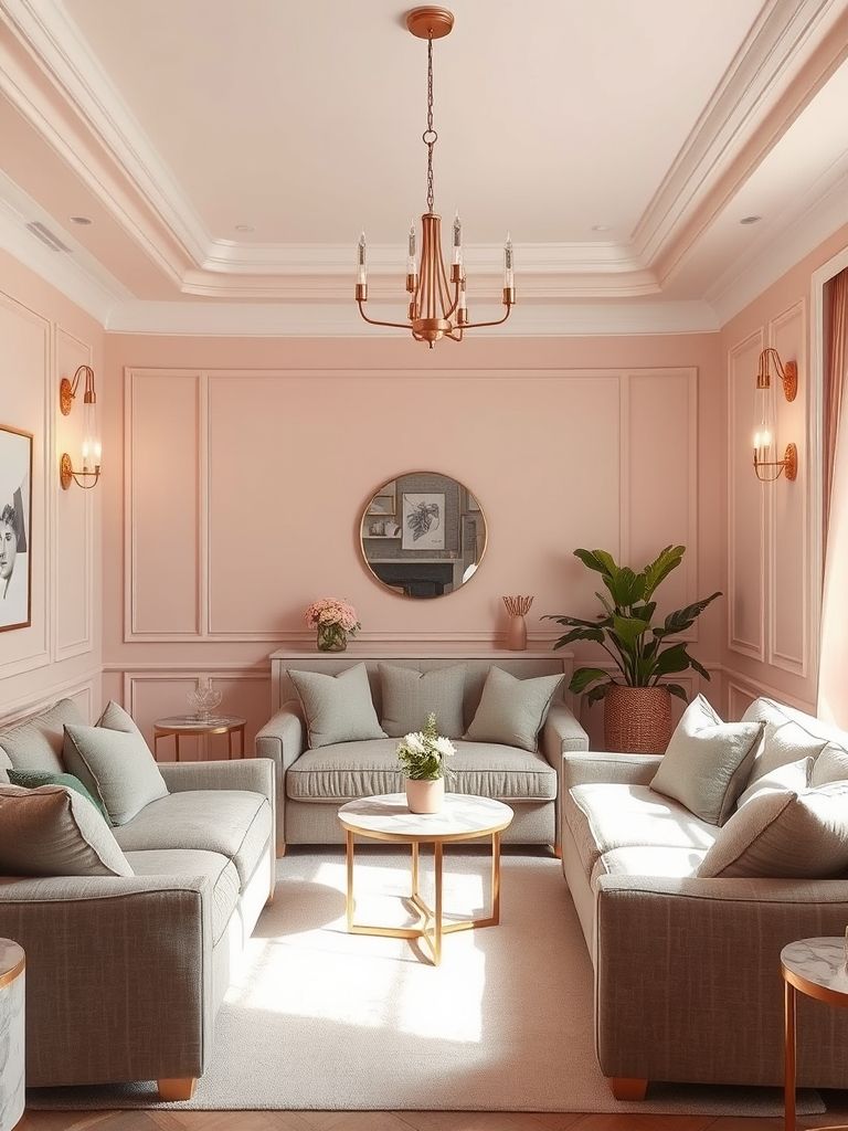
Ivory, Gold, and Dusty Rose Chic Palette
In a boutique apartment I once visited, ivory walls set a soft backdrop while dusty rose seating and gold accents added sophistication. It felt light, airy, and undeniably refined.
Ivory provides a neutral foundation that makes other colors stand out. Dusty rose offers a muted, romantic tone, and gold details add a sense of quiet luxury. The result is a palette that’s chic but still approachable.
Layering soft textures like velvet, silk, and cotton makes this palette come alive. An ivory sofa with dusty rose cushions and a gold-framed coffee table is a classic arrangement.
Lighting is crucial — natural daylight keeps the look fresh, while warm artificial lighting enhances the gold accents. In one space, I used a gold pendant light to cast a soft glow over a dusty rose armchair, and it completely transformed the corner.
Accessories should be chosen carefully. Too much gold can overwhelm, so I suggest using it in frames, lamp bases, or small decor items. Dusty rose can appear in throws, rugs, or floral arrangements for a soft, consistent touch. This palette is ideal for those who want elegance without sacrificing comfort. It’s feminine, polished, and timeless.
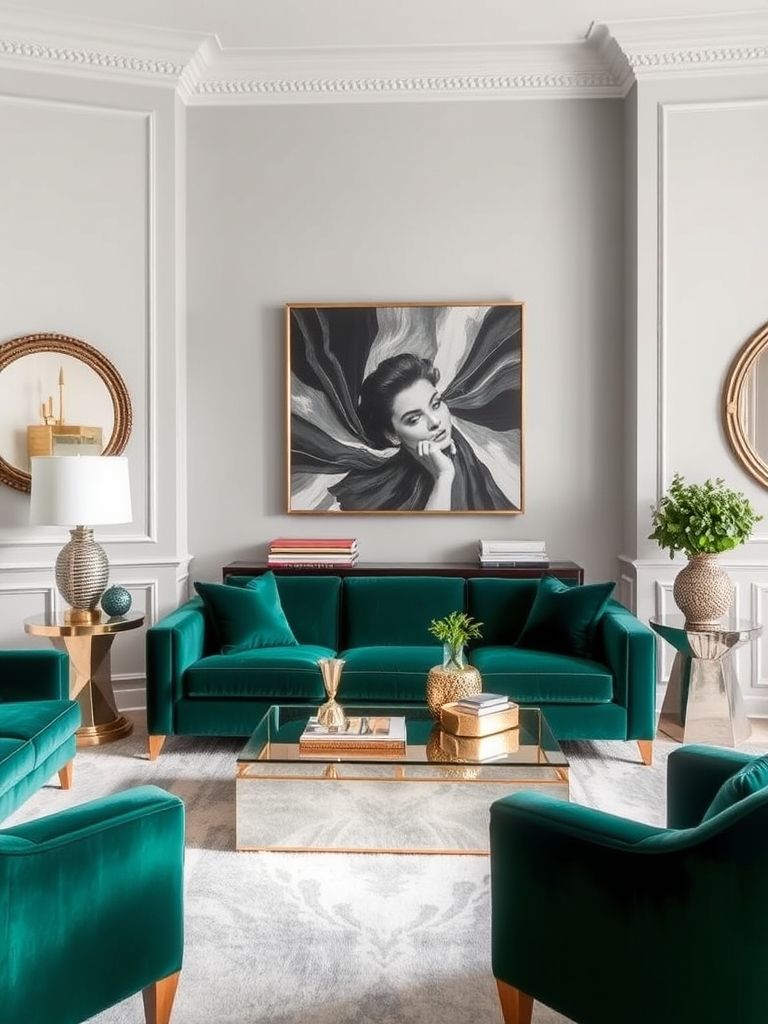
Light Grey and Emerald Jewel Tone Lounge
I once stepped into a living room where emerald green took center stage against light grey walls, and it immediately felt like stepping into a luxurious yet calming retreat. The grey kept things sophisticated, while the emerald brought depth and vibrancy.
Light grey is a modern classic. It works as a neutral but still has character, especially when it leans slightly warm or cool depending on the lighting. Emerald green, on the other hand, is bold and regal, instantly making any piece of furniture or accent stand out.
This combination thrives on contrast. A grey sectional sofa with emerald cushions looks sharp, while an emerald velvet armchair against a pale grey wall becomes a statement piece. The balance between the calm of grey and the richness of green is what makes it work so well.
Lighting plays a big role. Natural daylight brings out the freshness of the grey and the richness of the green, while warm evening lighting softens the palette for a cozier feel.
Metallics like brass or antique gold blend seamlessly here, adding a refined touch. In one project, I placed a brass floor lamp next to an emerald sofa, and it elevated the entire corner.
Textures can make the look even more dynamic — think soft rugs, velvet upholstery, and smooth glass accents. These elements keep the palette visually interesting without adding more colors. This pairing is perfect for those who want their living room to feel both sophisticated and inviting, with just enough drama to be memorable.
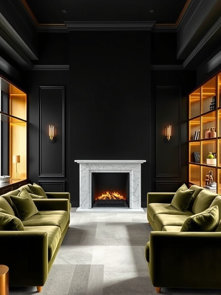
Matte Black, Olive, and Brass Luxe Mix
I once designed a space where matte black walls were paired with olive green furniture and brass details, and it created an atmosphere that was both moody and refined. The result was dramatic but never oppressive.
Matte black is bold, and it works best when balanced with warmer, earthier tones like olive green. Olive adds a natural element that softens the black, while brass brings in warmth and a touch of glamour.
This palette is ideal for open-plan spaces or rooms with plenty of natural light, as the darker tones need breathing space. In smaller rooms, using black on a single feature wall can still deliver impact without making the room feel smaller.
Brass is the perfect accent metal here. Whether it’s in light fixtures, side tables, or even picture frames, it ties the black and olive together beautifully. Textures matter — a matte black wall paired with velvet olive cushions or a brass-trimmed coffee table adds richness and avoids flatness. A mix of smooth, shiny, and soft textures makes the space come alive.
In terms of lighting, warm white bulbs enhance the brass and keep the overall feel from becoming too stark. Adjustable lighting can shift the mood from dramatic to cozy in seconds. This combination suits anyone who wants a space that feels bold and contemporary but still grounded in earthy comfort.
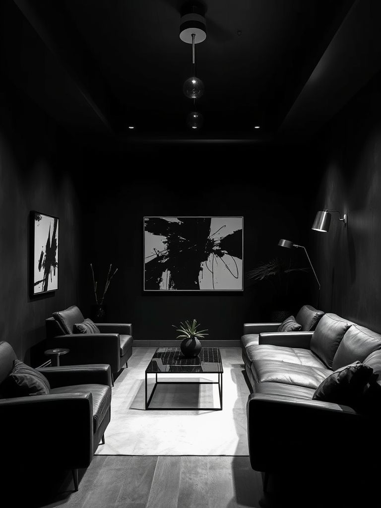
Monochrome Charcoal and Matte Black Lounge
I remember walking into a modern loft where everything was a study in dark tones — charcoal grey walls, matte black furniture, and just a few subtle highlights. It felt sleek, stylish, and undeniably confident.
Charcoal and black together create a powerful, minimalist look. The key to making it work is variation in texture and finish. Matte black absorbs light, while charcoal — depending on its finish — can reflect just enough to create depth.
This combination works well in large spaces with ample light, or in smaller spaces where you want to create a cozy, cocoon-like atmosphere. Layering is essential — think plush rugs, leather seating, and soft throws to break up the uniformity.
Metallics like chrome or brushed steel can work here, but they should be used sparingly to maintain the monochrome feel. A single reflective surface, like a glass coffee table, can also help lighten the visual weight. Lighting needs careful thought. Recessed lighting, track lights, or strategically placed lamps can highlight textures and keep the room from feeling too flat. This is a palette for those who love a modern, minimal aesthetic and aren’t afraid of going all in on dark tones. It’s strong, stylish, and timeless.
Moss Green and Mustard Mid-Century Vibe
I once visited a restored mid-century home where moss green and mustard yellow took the spotlight. The green felt earthy and grounding, while mustard brought a cheerful retro edge. Together, they created a look that felt nostalgic but still fresh.
Moss green works beautifully in mid-century interiors because it complements natural wood tones. Mustard yellow, with its warm golden hue, pairs perfectly with the rich walnut and teak often found in this style.
This palette is ideal for furniture with clean lines and organic shapes. A moss green sofa with mustard cushions or a mustard armchair next to a green accent wall can instantly set the mid-century tone.
Textures help complete the look — woven fabrics, leather, and wood grain all work beautifully here. In one design, I used a mustard rug under a walnut coffee table with a moss green couch, and it felt instantly cohesive. Lighting can enhance the retro vibe. Warm light makes mustard glow and softens the green, while pendant lamps in vintage shapes add authenticity.
Accessories like geometric prints, pottery, and retro-style clocks tie the look together without making it feel overly themed. This pairing is perfect for anyone who loves vintage charm but still wants a palette that feels relevant today.
Olive Green and Walnut Cozy Corner
I once worked on a reading nook where olive green walls met rich walnut wood furniture, and it instantly became the most inviting spot in the house. The colors complemented each other so naturally it felt like they belonged together.
Olive green has an earthy, calming quality that makes it ideal for spaces meant for relaxation. Walnut, with its deep brown tones and visible grain, adds warmth and visual richness. Together, they create an atmosphere that feels grounded and intimate.
This palette works beautifully with soft lighting. A warm-toned floor lamp casting light onto olive walls and walnut shelves can make the space feel like a private retreat.
Textiles add comfort and depth — think plush throws, woven rugs, and textured cushions in muted complementary tones. Cream or beige accessories can lighten the palette without breaking the cozy mood.
In terms of layout, this combination shines in smaller, contained areas like corners, alcoves, or compact living rooms. The colors wrap around you, making the space feel snug without feeling cramped.
Metallic accents in antique brass or bronze add subtle highlights and blend seamlessly with both olive and walnut. This pairing is for anyone who wants their living space to feel intimate, warm, and timeless.
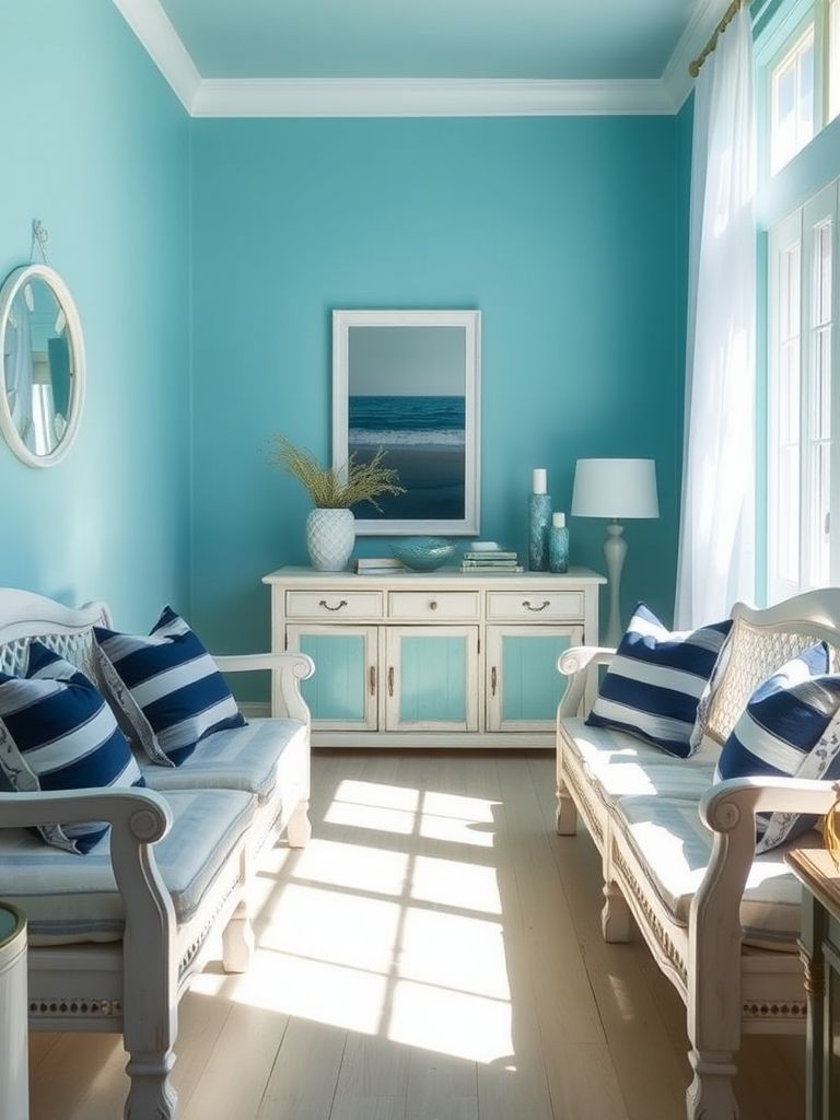
Pale Blue and Crisp White Coastal Palette
I once stayed in a beachside cottage where pale blue walls and crisp white trim made every room feel fresh and breezy. It was simple but had an effortless charm that instantly relaxed me.
Pale blue has a naturally calming effect, reminiscent of clear skies and ocean water. Crisp white keeps the look clean and bright, enhancing the airy, coastal feel.
This combination thrives in spaces with plenty of natural light. The colors reflect sunlight beautifully, making rooms feel larger and more open.
Natural textures — such as rattan, driftwood, and linen — work perfectly here, adding warmth without disrupting the cool palette. In one design, a pale blue sofa paired with white cushions and a wicker coffee table struck the perfect balance.
Lighting choices can push the look toward soft and romantic or bright and energizing. Warm evening lighting gives the blue a cozy glow, while cooler daylight bulbs keep it fresh and invigorating.
Decor accents like striped throws, nautical artwork, and glass vases filled with shells or flowers complete the coastal theme without going overboard.
This is a palette for anyone who wants a home that feels like a calm escape, no matter how far from the ocean they are.
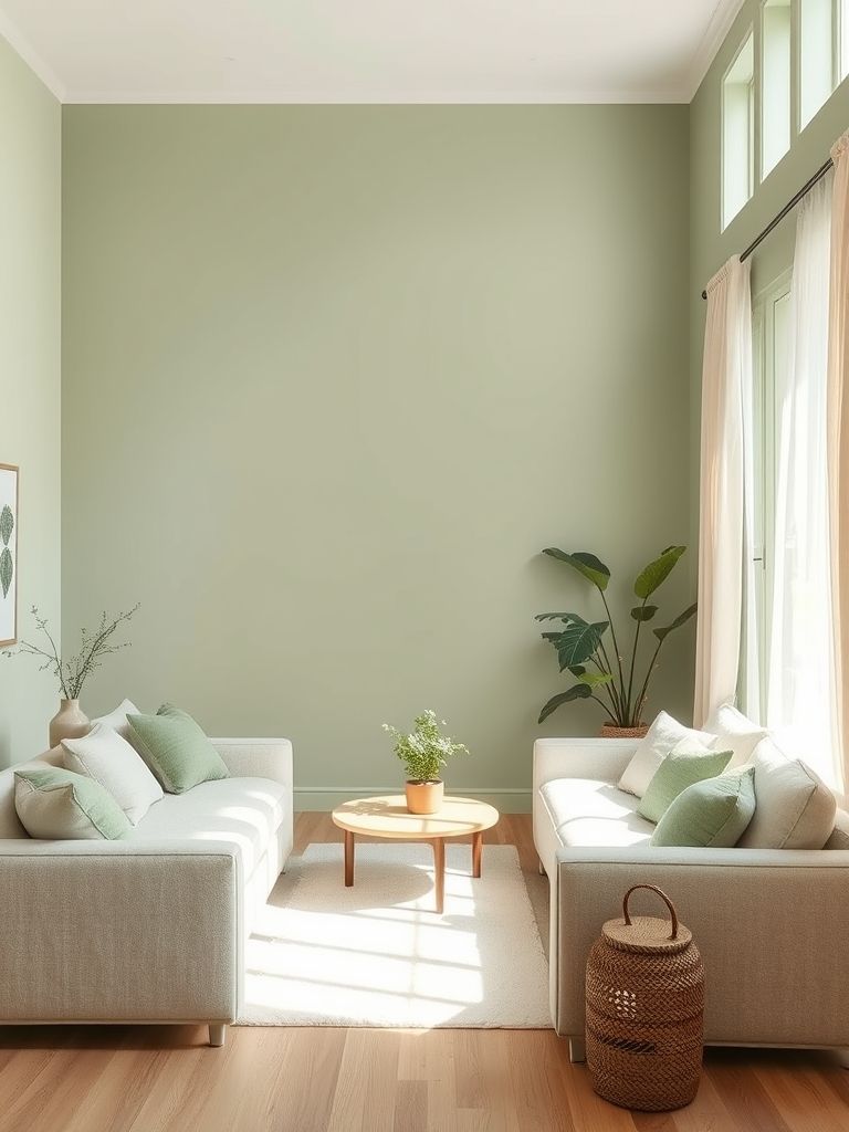
Sage Green and Cream Serenity
I once transformed a client’s cluttered living room into a peaceful haven simply by introducing sage green walls and cream furnishings. The change was immediate — the whole room seemed to exhale.
Sage green is gentle, earthy, and soothing, making it ideal for spaces meant to unwind in. Cream brings warmth and brightness, preventing the room from feeling too cool or muted.
This palette works well with soft textures — think knitted throws, linen curtains, and plush area rugs. Natural wood in lighter tones can also complement the look without stealing focus. Lighting plays a huge role in bringing out the best in these colors. Warm white bulbs enhance the cozy side of the palette, while natural daylight highlights its freshness.
Accessories like ceramic vases, woven baskets, and potted plants reinforce the organic feel of the room. Brass or gold accents can add just a touch of elegance without disrupting the calm atmosphere. This is the kind of color combination that feels timeless and works in nearly any style, from traditional to modern minimalist.
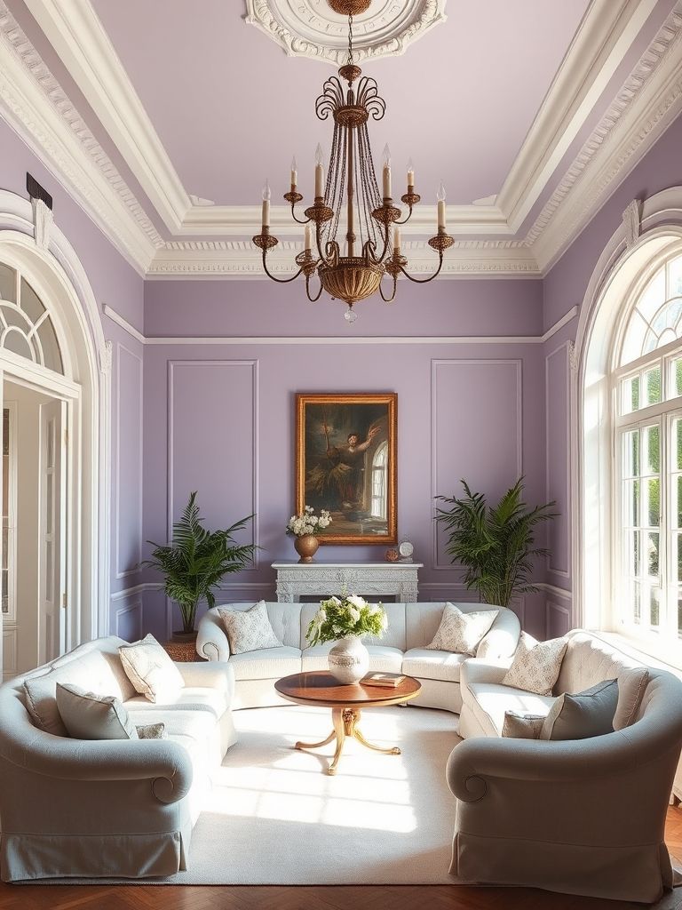
Soft Lavender and Cream Parisian Elegance
In a charming Paris apartment, I once saw soft lavender walls paired with cream moldings and furniture, and it was pure understated elegance. The space felt fresh yet sophisticated, with just the right amount of romance.
Lavender brings a delicate, almost ethereal quality to a room. Cream balances it with warmth and neutrality, ensuring the overall look doesn’t feel too sweet or overly feminine.
This pairing works beautifully in rooms with classic architectural details — think crown molding, tall windows, and herringbone floors. The colors highlight those features without overwhelming them.
Textures matter here. A cream velvet sofa against lavender walls, paired with linen curtains, can feel luxurious yet approachable. Adding glass or mirrored accents can also enhance the sense of light. Lighting is key — natural daylight makes lavender look fresh and airy, while evening lighting deepens its warmth for a cozier atmosphere.
For accessories, muted metallics like antique gold or brushed brass add a timeless touch. A lavender-and-cream floral arrangement or artwork can subtly echo the palette throughout the room. This combination is perfect for anyone who loves a refined, European-inspired aesthetic.
Taupe and Black Japandi Minimalism
I once designed a small living room where taupe walls met black accents, and the result was a perfect example of Japandi minimalism. The taupe brought warmth and softness, while the black added structure and definition. Together, they created a space that felt serene yet deliberate.
Taupe works beautifully in minimal interiors because it avoids the coldness that pure white can sometimes bring. Black, when used sparingly, adds a grounding element that keeps the space from feeling too light or washed out. This balance is what makes the Japandi style so appealing.
In one project, a low black coffee table sat in front of a taupe sofa, with a few ceramic pieces as the only decoration. The simplicity allowed the colors and materials to speak for themselves, without unnecessary distractions.
Lighting plays a big role here — natural daylight enhances taupe’s warm undertones, while evening lighting deepens the black’s impact. I like using paper lanterns or minimalist pendant lights to keep the overall feel soft and calming.
Textures keep the palette from feeling flat. Think linen cushions, wool throws, and smooth ceramic vases. A black-framed mirror or shelving unit can provide visual contrast without overwhelming the room. This pairing is ideal for anyone who appreciates clean lines, natural materials, and a calming atmosphere. It’s understated but never plain.
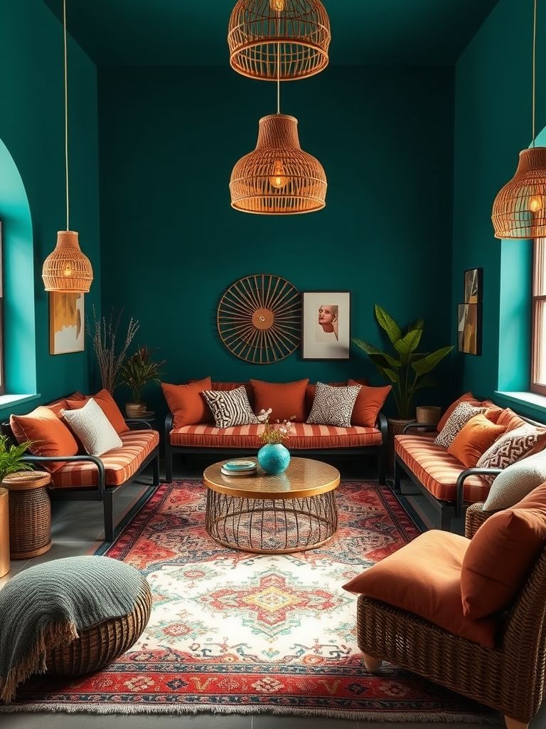
Teal and Clay Boho Fusion
I once visited a home where teal walls were paired with clay-toned furnishings, and it was the most relaxed and creative space I’d seen in months. The teal brought depth and coolness, while the clay tones grounded the palette with warmth.
Teal has a rich, jewel-like quality that works beautifully in bohemian spaces. Clay, with its earthy red-brown hue, softens teal’s intensity and adds a natural, sun-baked feel. Together, they strike a balance between vibrant and grounded.
In one design, a teal feature wall served as the backdrop for a low clay-colored sofa covered in patterned cushions. Layered rugs, woven baskets, and greenery completed the look without feeling cluttered.
This palette thrives in spaces with lots of texture — think rattan chairs, macramé wall hangings, and rough pottery. The combination feels global and well-traveled without trying too hard.
Lighting can shift the mood from cozy to energizing. Warm-toned bulbs make the clay glow and teal feel richer, while daylight brings out teal’s fresher, cooler side. It’s a perfect choice for those who love a mix of color, comfort, and eclectic charm. The look feels collected over time rather than perfectly matched.
Warm Beige and Rust-Toned Living Room
In a desert-inspired home I once styled, warm beige walls provided a gentle backdrop for rust-colored furniture and accessories. The result was cozy, inviting, and full of character.
Warm beige has a timeless quality that works in nearly any interior style. Rust, with its earthy orange-brown hue, adds depth and a touch of drama without overpowering the space. Together, they create a palette that feels both modern and grounded.
Layering is key here. A beige sofa with rust cushions, a woven rug, and terracotta pottery creates a warm, cohesive look. Natural wood furniture fits seamlessly into the palette, adding texture and visual interest.
Lighting enhances the richness of rust and keeps beige from feeling too plain. Soft, warm lighting works best — I’ve found amber glass lamps or shaded sconces perfect for this combination.
In accessories, choose pieces that echo the earthy tones — dried floral arrangements, clay vases, or abstract artwork in shades of ochre and sienna. This pairing is perfect for autumn-inspired interiors or anyone who wants their living room to feel like a year-round retreat. It’s comforting without being dull, and it ages beautifully over time.
Conclusion on Living Room Color
After exploring these twenty living room color combinations, it’s clear how much a palette can shape the feeling of a space. From the soft harmony of blush pink and taupe to the bold energy of navy and burnt orange, each pairing brings its own personality and mood. Colors are more than decoration — they set the tone for how a room feels, how inviting it is, and how it fits into daily life.
The most successful combinations I’ve seen aren’t chosen just because they’re trendy; they work because they feel right for the space, the lighting, and the people living there. When colors align naturally with textures and furnishings, the result is a room that feels intentional and complete.
Whether you want a calm retreat, a vibrant gathering space, or a timeless look, the right pairing can make it happen. These palettes offer inspiration for every style, from coastal lightness to mid-century warmth, and they show that color is one of the most powerful tools in home design.
Choosing the right colors isn’t just about style — it’s about creating a place that feels like yours every time you walk in.