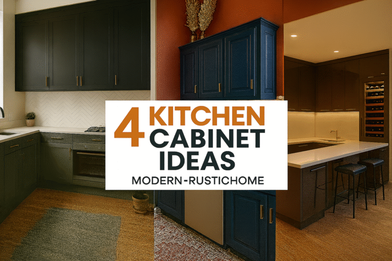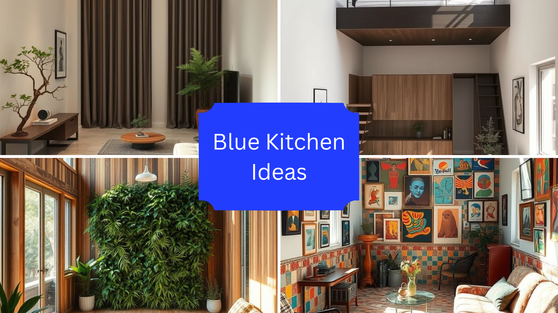
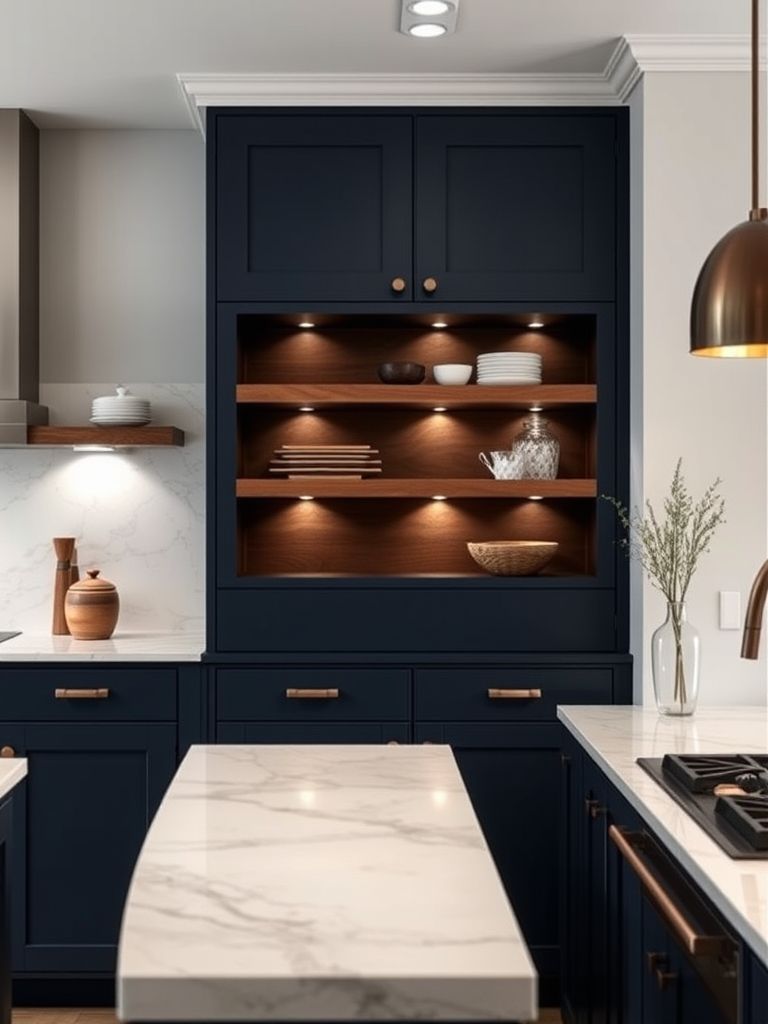
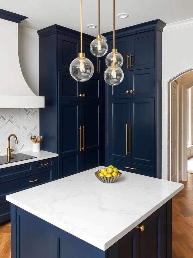
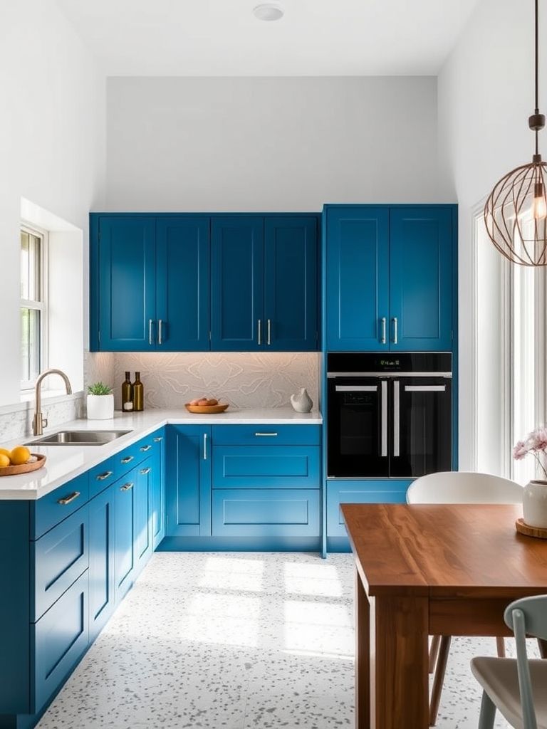
Blue Kitchen Ideas with Parisian & Retro Styles
I’ve always had a soft spot for kitchens—especially when they’re not just functional, but full of personality. Out of all the colors I’ve seen over the years, blue always manages to steal the show. It can feel calm, bold, fresh, or even dramatic—depending on how it’s used. I recently spent time studying different kitchen setups, and I noticed a trend I couldn’t ignore: blue is everywhere, and it’s making kitchens feel anything but ordinary.
During my visits, I came across kitchens that felt like cozy Parisian cafés, others that looked like futuristic art spaces, and some that made me feel like I’d stepped into a beach house. From brass details to terrazzo tiles and faded denim tones, blue proved it could adapt to any design language. I wasn’t just looking at paint on the walls—I was seeing personality, mood, and even culture reflected in each space.
This article is my attempt to capture that experience. I’ve broken down 20 blue kitchen designs that I personally explored and admired. Each one tells a story. Some are playful, others are luxurious. Some reminded me of family holidays, while others felt like something out of a design magazine.
So if you’re thinking about bringing blue into your kitchen—or you’re just curious to see how far this color can go—this list will give you plenty of ideas. Let’s walk through them, one kitchen at a time.
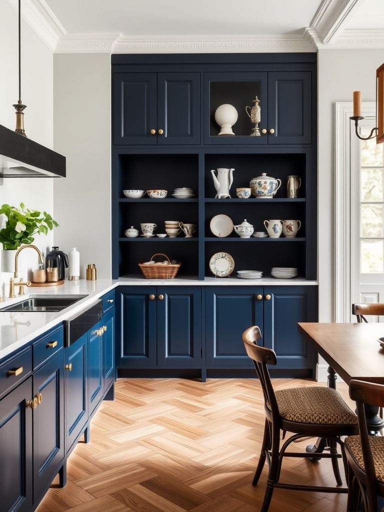
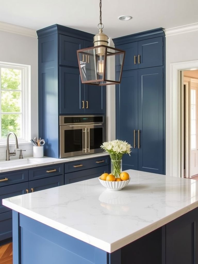
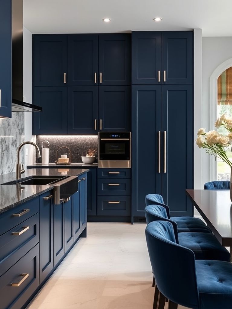
Blue and Brass Parisian Touch
The moment I walked into this kitchen, it felt like I’d stepped into a boutique flat in the heart of Paris. The blue cabinets had a quiet elegance—deep, rich, and matte—without being too flashy. But what really stood out were the brass details. The handles, the faucet, even the trim on the open shelving had that warm metallic glow that made everything feel upscale but not overdone.
It wasn’t a massive space, yet it didn’t feel cramped. That’s the magic of Parisian style—smart layouts and bold personality packed into compact rooms. The blue helped ground the space, while the brass added light and energy. I noticed the backsplash was simple white tile, which made the color contrast stand out even more.
What impressed me most was how well the mix of vintage and modern came together. There was a mid-century dining chair tucked under a marble-topped breakfast bar, and an antique mirror casually leaned against the wall. Somehow, it all worked. The color palette helped tie it together. Blue and brass aren’t just a stylish combo—they’re timeless.
If you’re after a kitchen that feels both romantic and refined, this style is a winner. You don’t need a chandelier or high-end appliances. Just the right shade of blue and some thoughtfully placed brass accents can make your kitchen feel like it belongs in a Paris design journal.
2. Blue on Blue Monochrome Kitchen
I didn’t expect to be so drawn to a single-color kitchen until I stood in front of this one. The designer took a risk—blue walls, blue cabinets, even blue tiles—and somehow, it worked. Each shade was slightly different, but all within the same color family. It created depth without feeling too busy. It was like stepping into a calm, cool wave that wrapped around the entire room.
What caught my eye was how texture replaced contrast. Matte cabinets, glossy subway tiles, and a brushed metallic range hood—each surface played with the light differently. There was no need for wild patterns or extra accessories; the variations in materials did all the talking.
Even the lighting fixtures were painted blue to blend in. That’s when I realized the genius of this kitchen: nothing shouted for attention, yet everything felt intentional. It felt like a designer’s sketch come to life—precise, clean, and oddly soothing.
I wouldn’t have believed a full blue kitchen could feel this balanced without seeing it myself. For anyone who loves color but wants control, this monochrome approach is a clever way to go bold without losing harmony.
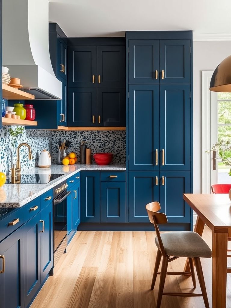
3. Blue Terrazzo Pattern Pop
I’ve always liked terrazzo, but I’d never seen it used quite like this. The floor was the first thing I noticed—small fragments of sky blue, navy, and teal scattered across a light base. It was bold, cheerful, and full of energy. Then I looked up and saw the same pattern used as a backsplash, and suddenly the kitchen felt like art.
What made this space stand out was the contrast. The cabinets were flat matte blue—no hardware, no decoration—letting the terrazzo do all the visual heavy lifting. But it didn’t feel chaotic. The repetition of pattern helped everything stay cohesive, not cluttered.
There were little splashes of fun, too—a curved stool with pastel legs, a plant in a bright yellow pot. It felt like the kind of kitchen where someone creative lives, someone who likes color and doesn’t take themselves too seriously.
Honestly, this kitchen made me smile. It reminded me that design doesn’t always have to be minimal or safe. Sometimes, it’s the joyful patterns that bring a space to life.
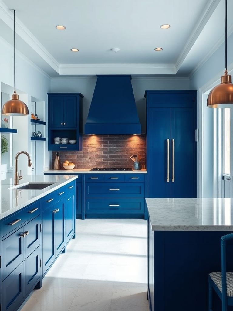
4. Bold Sapphire Statement Kitchen
This one had presence. There’s no other word for it. The cabinets were a rich sapphire blue, almost glowing under the natural light. Every surface seemed polished and confident—this was a kitchen that didn’t want to blend into the background.
I noticed how the designer had kept everything else very quiet—white countertops, stainless steel appliances, and light wooden floors. It was like the whole room existed to highlight the blue. And it worked. The color took center stage, but never felt overpowering.
What stood out most was the use of symmetry. The upper cabinets matched the lower ones perfectly, and the island sat dead center under a bold pendant light. It gave the whole room a sense of order, like a visual anchor in a sea of color.
I walked away thinking, if you want your kitchen to feel modern, strong, and luxurious—go bold. Sapphire isn’t subtle, but when done right, it’s unforgettable.
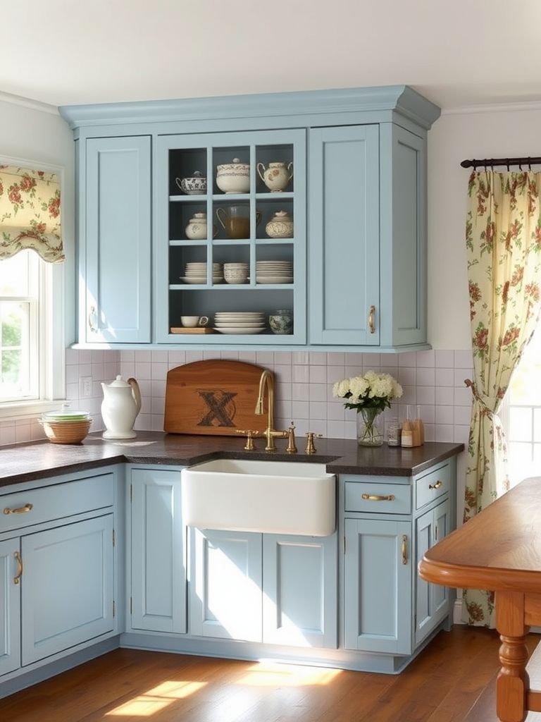
5. Classic Blue and Marble Elegance
This kitchen was pure calm. The cabinets were a muted navy, almost leaning toward gray, and the countertops were sleek white marble with delicate blue veining. I immediately felt like I was in a home that valued tradition, but appreciated the finer things.
The layout was open and airy, with large windows letting in soft daylight that bounced off the marble. It made the blue feel even more grounded. A tall vase of eucalyptus on the island and soft linen curtains in the background gave the space a peaceful rhythm.
What I admired most was the restraint. Nothing felt extra or out of place. The marble wasn’t loud, the hardware was brushed nickel, and the lines were clean. It felt like someone had edited the kitchen down to just what was necessary—and nothing more.
This one left a lasting impression. If you’re drawn to understated luxury and timeless design, this is the blueprint. Classic, quiet, and effortlessly refined.
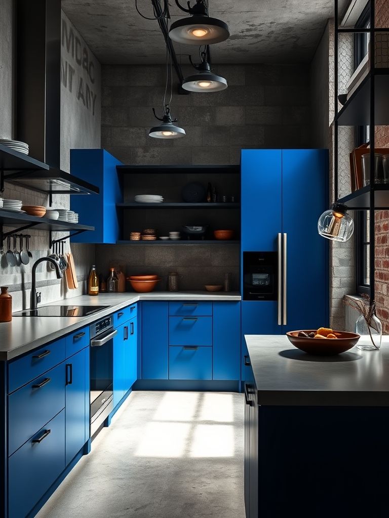
6. Cobalt & Concrete Boldness
I wasn’t sure how cobalt blue and concrete would get along—until I saw this kitchen. It was unexpected, but the combination worked beautifully. The cabinets were this rich, electric blue that popped against the raw gray of the concrete walls and floor. It felt like a cool city loft with a rebellious edge.
What really pulled it together were the small details. The countertop was a slim slab of black stone with subtle blue undertones, and the pendant lights had concrete finishes that matched the wall texture. It felt like someone had carefully balanced contrast and harmony.
This kitchen didn’t try to be cozy or soft—it was confident and raw, and proud of it. I could imagine it belonging to someone who works in design or architecture—someone who enjoys bold statements and isn’t afraid of strong materials.
It left me thinking that industrial doesn’t have to mean cold. With the right color punch, even concrete can feel alive.
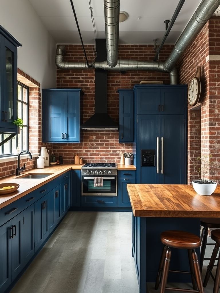
7. Denim Blue Industrial Mix
The first thing I noticed here was the tone—it felt effortlessly cool. The denim blue cabinets weren’t polished or flashy. Instead, they had a soft matte finish, like your favorite worn-in jeans. Paired with open black metal shelves and exposed pipes, it created a look that was gritty yet stylish.
There was a lot of rawness in the space—brick walls, concrete flooring, and even some visible wiring—but the blue softened it all. It was like the color was doing double duty: making the room feel grounded and also giving it a subtle warmth.
I especially liked the reclaimed wood bar that broke up the metal and blue surfaces. It added just enough texture to make the space feel layered. Nothing felt forced, either. This kitchen had a personality that said, “I didn’t try too hard,” but everything was clearly thought out.
I left thinking how denim blue is the perfect bridge between color and neutrality. It brings depth without drama, especially when mixed with industrial finishes.
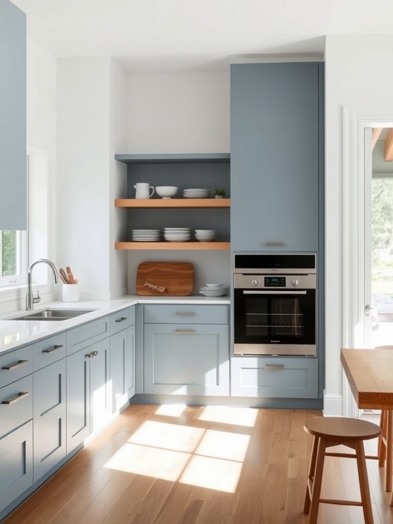
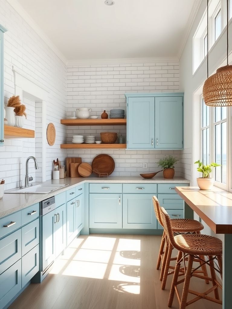
8. Dusty Blue Scandinavian Minimalism
This kitchen was pure calm in color form. The cabinets were dusty blue with clean, flat fronts and no visible handles. The countertops were white, and the floors were pale wood. Natural light poured in from a large window, and there were no curtains—just openness and simplicity.
I admired how every inch had a purpose. There were no extras, no unnecessary décor. A single plant on the windowsill and a ceramic bowl of lemons on the counter were all it took to make the space feel lived-in. It reminded me how powerful quiet design can be.
What made it memorable was how human it felt. The open shelving held everyday items—glassware, spices, a teapot—nothing curated, just real life on display. That’s very Scandinavian. Function always comes first, but the form follows so gracefully that you forget how clever it all is.
If I had to live in a kitchen that made me feel relaxed every single day, this would be it. It whispered instead of shouting—and still said everything it needed to.
9. Matte Indigo Luxury
This kitchen didn’t sparkle, and that’s exactly why it stood out. The indigo cabinetry had a matte finish that absorbed light instead of reflecting it, creating a deep, velvety atmosphere. It was moody in the best way—luxurious, without being loud.
The layout was sharp and modern: tall cabinets flush to the ceiling, a long island with waterfall edges, and just the right amount of negative space. Brass details peeked through—on the bar stools, the faucet, and even the light fixtures. It added elegance without stealing the spotlight from the indigo.
I loved how the color behaved throughout the day. In the morning, it looked cooler—almost bluish-gray. By evening, under warm lighting, it turned rich and inky. That shifting tone made the kitchen feel alive, like it had its own rhythm.
This setup is for someone who appreciates mood and maturity in their space. It’s not trying to impress—it just exists confidently, with style that sneaks up on you.
10. Midnight Blue and Walnut Combo
Here’s where classic wood met bold color, and the result was stunning. The base cabinets were midnight blue—deep and shadowy—while the upper ones were made of smooth walnut wood with a satin finish. Together, they created this rich, warm feeling that instantly made the space feel inviting.
I noticed how the designer used lighting to highlight the textures. Under-cabinet strips illuminated the wood grain, while pendant lights above the island cast a soft glow on the navy surfaces. The contrast between cool and warm tones made the space feel alive without being overstimulating.
What really sold it for me was the island seating area. It had a walnut waterfall edge that matched the upper cabinetry, and it felt like a furniture piece in its own right. Everything was coordinated but not too perfect—there was still room for personality.
This is a look I’d recommend to anyone wanting elegance without sterility. It’s grounded, a little moody, and full of natural character.
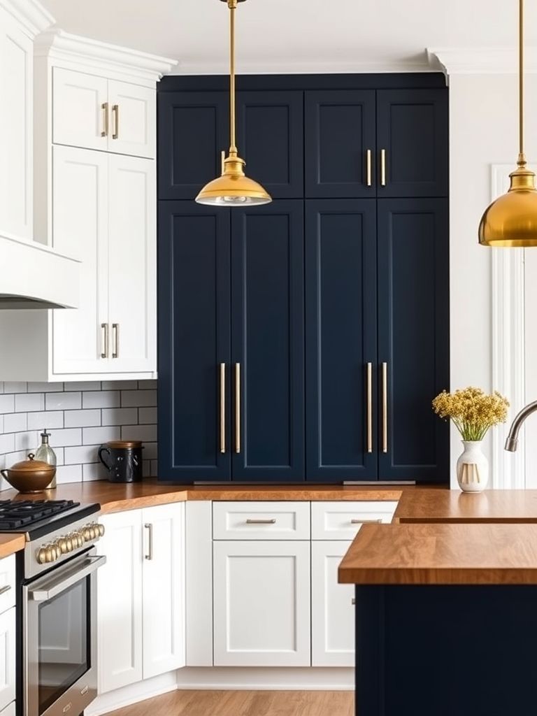
11. Navy Elegance with Gold Touches
This kitchen felt like it belonged in a design magazine. The navy blue was saturated and formal, like a tailored suit. But instead of feeling stiff, it was elevated by warm gold accents that showed up just where they were needed—on the cabinet handles, the faucet, and the pendant lights.
The layout was symmetrical and balanced, with tall cabinets on either side of a statement hood in brushed gold. It gave the entire room a sense of structure, like every detail had a place. Even the backsplash followed suit—white subway tiles laid out with precision and grouted in a soft gray.
I was especially drawn to the way gold warmed up the navy. Blue can sometimes feel cold, but those metallic hints added a soft glow that brought everything to life. It wasn’t over the top. It was tasteful and intentional.
If you’re after a high-end, formal look with just a touch of shine, this pairing of navy and gold is hard to beat.
12. Jean-Inspired Aqua Kitchen
This kitchen immediately reminded me of my favorite denim jacket—faded, soft, and full of character. The cabinets were a light aqua with a worn-in look that didn’t feel artificial. It wasn’t just about the color—it was about how lived-in and casual the whole space felt.
The open shelving had stacks of white dishes and ceramic mugs, while the backsplash was a pale, slightly textured tile that added to the handmade vibe. There were no shiny finishes here—everything had a soft matte or natural wood touch that made the room feel grounded.
I liked how the appliances were integrated but not hidden. The fridge had the same aqua front as the cabinets, blending in without trying to be invisible. That honesty in design was refreshing. It said, “This is a working kitchen, not a showroom.”
It made me realize that not all kitchens need to be sleek or polished. Sometimes, what people want is comfort—and this jean-inspired blue nailed it.

13. Ombre Blue Cabinet Gradient
At first glance, I thought this kitchen was just playful. But the longer I stood there, the more I realized how thoughtful it was. The cabinets started with pale blue at the top and gradually deepened to navy at the bottom—a smooth ombre gradient that looked hand-painted.
This color fade wasn’t just for looks. It visually grounded the space. The lighter colors up top made the ceiling feel higher, while the darker lower cabinets kept things stable and balanced. It was both artistic and functional, which is rare.
The rest of the kitchen was simple—white counters, stainless steel sink, and a few glass pendant lights. That allowed the cabinets to stay in the spotlight without competition. Even the drawer handles followed the gradient theme, subtly changing shades to match the doors.
This was one of the most creative kitchens I saw. It took a common idea—blue cabinets—and turned it into something original. I could easily see this style in a small city apartment or a design-forward home.
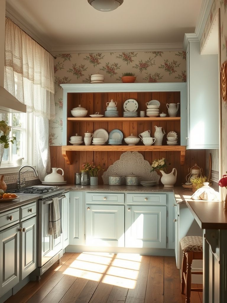
14. Pale Blue Cottagecore
Walking into this kitchen felt like stepping into a storybook. The pale blue cabinets were soft, almost powdery, and paired with floral curtains, open shelves, and a vintage oven that looked like it had a history. The whole space had a charming, countryside energy.
There were copper pots hanging from a rack above the stove and mismatched mugs on display. Nothing was symmetrical, and nothing needed to be. It had that perfectly imperfect look that’s so central to the cottagecore aesthetic.
The floor was painted wood, slightly worn from use, which only added to the feeling that this kitchen was truly lived in. There was a vase of wildflowers on the table and handwritten recipes pinned to a corkboard. It didn’t feel styled—it felt personal.
I left with a warm feeling in my chest. This kitchen wasn’t just about color—it was about creating a homey, nostalgic space where everything had a story.
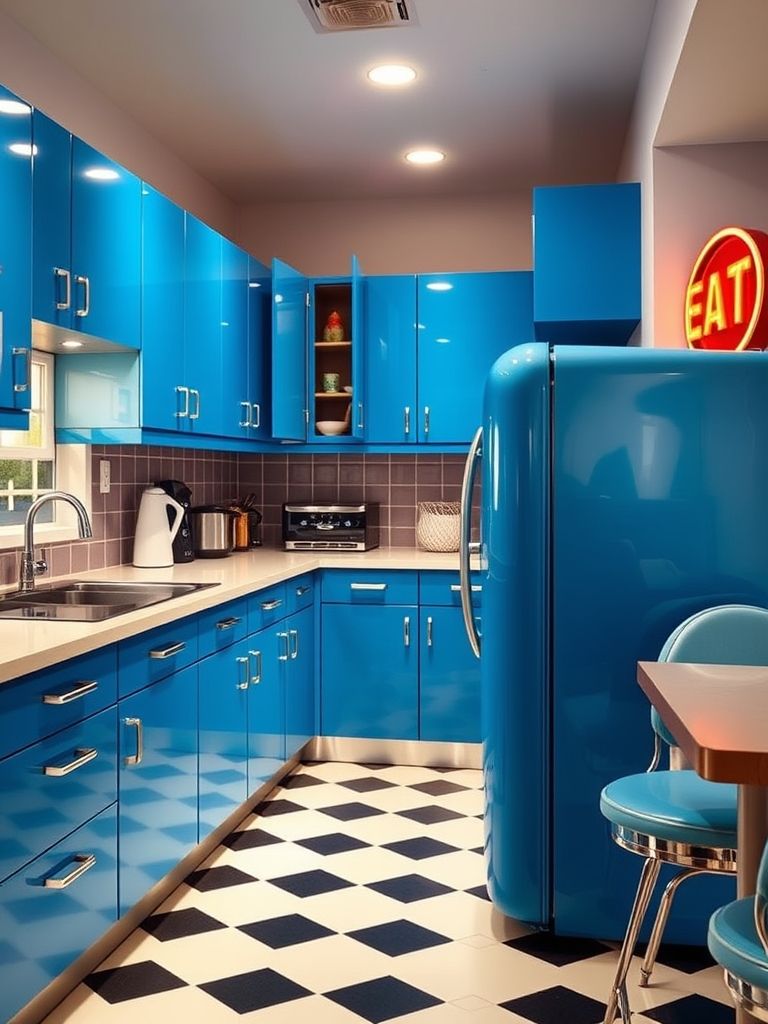
15. Royal Blue Retro Revival
This kitchen had a time-travel vibe, and I loved every bit of it. The royal blue cabinets were glossy and bold, and the retro appliances—cream-colored with chrome edges—fit in like puzzle pieces from another decade. It was like stepping into the 1960s, but with modern plumbing.
The tiles were a checkerboard of white and blue, and the light fixtures had that classic diner look. Even the stools at the counter had rounded backs and leatherette cushions. It was playful, but not gimmicky—it respected the style it was borrowing from.
One thing I appreciated was the commitment. Nothing looked out of place. The designer didn’t just toss in one or two vintage elements—they went all in. And because of that, the kitchen had a strong identity. It wasn’t trying to be trendy—it knew exactly what it was.
If you love a kitchen with personality, color, and a touch of throwback flair, this retro royal blue setup is one to remember.
16. Sky Blue Farmhouse Flair
This kitchen felt like a fresh morning. The sky blue cabinets were light and cheerful, instantly brightening the room. Paired with shiplap walls, a farmhouse sink, and antique-style bronze fixtures, it created a perfect mix of rural charm and modern livability.
The island had a butcher block top that looked like it had seen many family meals. Open shelves held mason jars, dried herbs, and cookbooks with cracked spines. Everything told a story, and I could tell this wasn’t a kitchen built just for show.
I liked how nothing felt overly curated. There were dents in the hardware and scuffs on the wood floors—but that made it better. The blue was clean and crisp, but the overall feel was warm and easygoing.
This was the kind of kitchen where you could picture someone baking bread on a Sunday morning, windows open, coffee brewing. It wasn’t just about the look—it was about how it made you feel.
17. Soft Powder Blue Coastal Kitchen
This kitchen felt like a slow ocean breeze. The powder blue cabinets had a gentle tone, almost like the sky just before sunset. Paired with whitewashed wood and sandy-colored tiles, it created the lightest, softest kind of coastal vibe. It didn’t shout “beach house”—it whispered it.
There were little nautical nods throughout the space—rope handles on the drawers, a glass light fixture shaped like a buoy, and driftwood accents along the open shelving. But nothing felt over-themed. It was casual, like someone had picked up pieces from the shoreline over the years.
The windows were huge, letting natural light flood in and bounce off the pale surfaces. Everything felt fresh and open, like you could breathe better just being in the space. Even the sink was by the window, facing out toward what I imagine was a sea view.
This kitchen didn’t need bold statements to make an impression. Its calm colors and soft materials made it feel like a place to relax and reconnect.
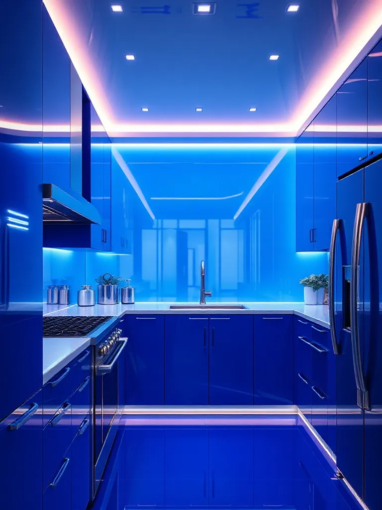
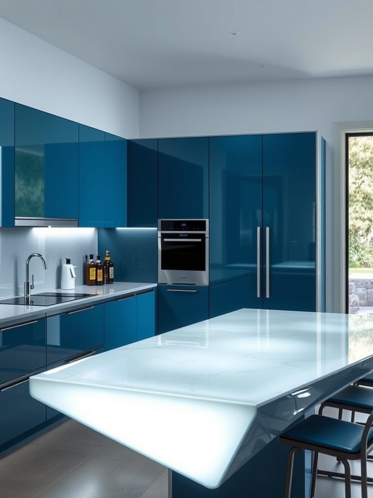
18. Steel Blue Futuristic Kitchen
This was easily the most forward-looking kitchen I visited. The steel blue cabinetry had a metallic sheen that felt sleek without being cold. Every edge was sharp, and every handle was hidden. It was clean, angular, and unlike anything else I’d seen.
The lighting was all LED—under cabinets, inside drawers, even along the kickboards. And the appliances were touch-activated, blending seamlessly into the flat surfaces. I felt like I’d walked onto a set for a sci-fi movie, except it was real and functional.
What balanced the tech feel was the color itself. Steel blue added just enough warmth to avoid looking sterile. It had depth and dimension, especially when lit from different angles. A matte black faucet and pop-up sockets kept everything modern without overcomplicating things.
If you’re a fan of minimalist design with a futuristic twist, this kitchen proves that high-tech can still feel human—with the right shade of blue.
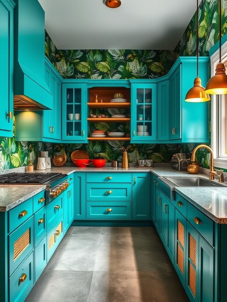
19. Teal Tones with Tropical Flair
This kitchen was vibrant in the best way. The teal cabinets were bold but inviting—somewhere between deep turquoise and soft green. Paired with rattan pendant lights, banana leaf wallpaper, and bamboo bar stools, the whole room felt like a tropical escape.
I noticed how the color made the space feel cooler, especially when sunlight hit the tiles. The backsplash had hints of seafoam and mint, and even the dishes followed the same palette. It was a clear case of design commitment—and it worked.
The vibe was playful. There were potted palms on the counter, open shelves filled with colorful bowls, and a retro-style fridge in soft mint. It felt like a place where food is cooked with laughter and the windows are always open.
This kitchen reminded me that bold color doesn’t have to be overwhelming. When grounded in natural textures and consistent accents, teal can feel as relaxed as a beach vacation.
20. Two-Tone Navy & White Contrast
This kitchen was all about balance. The upper cabinets were crisp white, while the lowers were a rich navy blue. That contrast created a clean, structured look—simple, sharp, and timeless. It’s the kind of combo you’d expect to see in a modern home that still wants a hint of classic style.
The navy brought depth, grounding the space, while the white made everything feel bright and open. Brass handles tied the two tones together, and the backsplash—a textured white herringbone—added just the right touch of movement.
What I liked most was the symmetry. The island mirrored the two-tone layout with white paneling and a navy base, making the entire design feel cohesive. Even the pendant lights had navy cords with white shades—a small but smart detail.
If you’re after something safe but stylish, this layout offers both. It’s proof that when done thoughtfully, simplicity can be striking.
Conclusion
After spending time with all these kitchens, one thing became clear to me—blue isn’t just a color; it’s a design language. I saw it speak in whispers through soft powder tones and shout with confidence in bold royal shades. It played well with concrete, marble, wood, and even terrazzo. And no matter the style—Parisian, retro, industrial, coastal—it always found a way to fit in.
I didn’t expect to walk away with so many favorites. Some kitchens felt like calm retreats. Others made bold design moves that I wouldn’t have thought to try. But each one taught me something. About how light hits a surface. About how color can change a mood. About how small details—like a brass handle or gradient cabinet—can elevate an entire space.
If you’re thinking of redesigning your kitchen, I’d say don’t be afraid of blue. Whether you’re leaning toward a soft cottage look or a futuristic palette, there’s a version of blue that will fit your space—and your personality. It’s a flexible, emotional, and quietly powerful color.
Personally, I walked away feeling inspired. And now, whenever I step into a kitchen, I can’t help but wonder: what would blue do here?